Friday, February 28, 2014

Mid-Atlantic Quilt Show

This is "Shenandoah Falling".  It is my first of three 2014 show quilts to be introduced.  It is currently at Mancuso's Quiltfest, Mid-Atlantic Show in Virginia.  This is one of the first shows of the season and gets a good response from quilters anxious to get their quilts back into the shows.  It's typically a hard show, so I'm very delighted how my two quilts there did.   This little 51"x35" wonder took the best wall quilt award!
It started more or less as an experiment.  I wanted to make a modern quilt, but not the typical type of modern quilt everyone thinks of with modern fabrics and lots of white.  I wanted to bring my kind of modern to the table, whatever the heck that is?!? Solids, texture and kick-ass quilting.

I bought a couple of Cherrywood's Grab Bags for Crazies when they were on-sale two for one last year. Everyone loves Cherrywoods...they just have a rich look and such indulgent colors.  The grab bags are their mistakes, end cuts and mis-dyes so each bag has a little of everything and anything.  There are colors in these bags that you probably can't just order.  The pieces tend to be about 6-7" by 10", so planning a conventional or traditional quilt proved fruitless (after several tries). One quilter friend of mine (after seeing me redesigning and redesigning) just said to me "enough, just cut them".  And so I did.  I went about this completely without a plan.  The first phase of the experiment had begun.  Could I actually make a quilt without designing it first?  Am I capable of winging it?...

I started by cutting 4 or 5 of these scraps into about 7" squares.  They are all stacked together, and free cut like I show.  Each set of blocks has slightly different curves.
I rearrange the pieces and sew the curved blocks together.  If I think that one needed a little different color, then another piece is added onto one of the corners.  The process of creating these blocks took me many weeks.  Free-pieced shouldn't necessarily mean fast.
Then I would arrange what I had on the floor.  I knew early on that I wanted them on point because this is visually more interesting, and to me, it evokes the feeling of flow better.  I would then assess where I needed more or different colors.
 <>>
Sorry, I'm not sure how to fix this without altering the original.  You get the idea though.  By the time I added the borders, it had a good bit of tweaking done.  I love how it looks like the sun might be poking through the leaves.  Guess I failed to mention that since these were Cherrywoods in luscious shades of "fall", this is depicting the autumn leaves.
I chose to add axisymetrical borders.  Not only are they different widths, they are different colors.  The deepest and widest is at the bottom, giving the scene depth.  And now if you twist your head the opposite direction, you can see what the background looks like with the addition of the blue leaves (sarcastic snort). They are blue because I wanted a modern twist on the expected (and because I had a dozen shades of blue fabric scraps!).  It really does look better if viewed upright!
In my classic style, it is no doubt quilted half-to-death.   I don't have too many finished, detail photos of the quilting, but here are a couple.  The serpentine vines/feathers that intertwine through the falling leaves are done to look like I did trapunto.  In fact, no trapunto at all -- just the usual double 80/20 and wool battings, coupled with very dense back filling to make the feathers pop.  I love the effect that the random circles bring to the "flow".  Each of the leaves is quilted differently too.
Threads used...several.  The primary motifs are stitched in a 40wt Glide or YLI polished poly.  The detail/dense stitching is either Invisifil or SoFine.  Finer threads allow the colors of the gorgeous fabrics to show through.
 Of course, there is a piped binding, and it varies from pale blue to deep indigo as you go around the quilt.  As an additional modern twist, I didn't do the typical 1/4" binding either.  This has a 1/2" binding, and as shown above, the color of the binding perfectly matches that of the outer border, right down to the angle between the colors.  The devil is in the details, and details win quilt shows.  But then, you already know that I am a nit-picker for these type of subtle details.

I'm hoping that the resolution of the first picture is high enough to just zoom in and see the quilting details.  I chose all kinds of odd-ball things that I know you wouldn't associate with my quilting.  The different quilt styles (triple stitch crosshatch and parallel lines) on opposing borders does go against my innate need for symmetry, but it grabs that modern, do-whatever, just wing-it aesthetic I wanted to go for.  The overall quilt is immensely textural.   Where some of the quilt disappears on the colors of the top, the back lays it all out for the eye to see... <>
Hope you enjoyed this first look at my 2014 quilts.  There will be more to come soon (my other new quilt also got a ribbon!)

Tuesday, February 25, 2014

Paducah

Though I don't have plans as of this point in time to attend the Paducah quilt show, as I went last year, my quilt Kaleidoscopic Calamity will be attending.  Official notifications went out yesterday.  My quilt is amongst the names of some very prominent quilters, many of whom I compete with on a regular basis.  It's truly the "who's who" of exceptional quilters.  Having been to both Paducah and Houston, I'll take this show anyday.  The caliber of most quilts is high.  One thing I felt last year was that the show lacked the depth of talent in the smaller quilts.  MANY of the large wall and bed quilts blew your mind, yet the smaller wall were  less thrilling.  My quilt is in that small wall category this year...perhaps I can bring it home with this quilt.  Either way, getting accepted is the honor.

Monday, February 24, 2014

QOV Block-a thon

With barely 6 weeks until MQX, time is of the essence to get my QOV block donations completed.  I have a hefty pile here of both colorways, but also have about 30-40 more cut out that I really should get stitched. Last weekend, my mom and I stitched quite a few.  I am not sure I will meet last year's number of 208 donated, but it is possible if I have a few helpers (hint, hint!!).  It is for a great cause, and the two blocks I have chosen to make really do stitch up quickly.  I make 6-8 per hour.  As always, if you are interested, just contact me.

I happily have all 3 kids back to school today.  Vacations this winter seem to drag on and on.  The last two had extra days on each end because of snow.  I managed to get a lovely tablecloth quilted today, which I hope to show tomorrow or Wednesday.

Until then, sew on!

Thursday, February 20, 2014

Making Olympic Progress

For those of you in the northeast, you are painfully aware of how much snow we have gotten recently. February has been a doozy of a month, but in the last week alone, we have had 4 snow-storms totally a minumum of 6" per storm, and a max of nearly a foot a couple times.  My hard has snow chest high.  Despite it being 52F today (go figure!), this isn't going away anytime soon!  

It has also been my kids' vacation week...or else they'd probably have had another 2-3 snow days.  I have not been nearly as productive with the client work, as my studio is on another level of the house, but I have gotten through a few E2E's none the less.  I have been sucked into the productivity black hole called Sochi.

I am more or less a skating junkie, and this olympics is no exception.  With one of the NBC channels playing every one of the skaters (if you watch the competition live), it is hard to do regular work during the day and watch their meager evening offering of skating.  During the many breaks for judging, etc, I have been working on a couple of my things though.  

This is a wholecloth design I started over a year ago.  It had more to it, but I hacked it up, put it on point and then added some different divisional lines/quilting.  It will be stitched in colored thread (maybe not the colors here) on ivory silk.  Soon, I hope too...I bought the silk in Houston.  I just need to get the design enlarged, copied to the fabric and order some thread.
 (and as always, please do not try to copy or pin these photos, or I will just not share...I believe I have code in place to prohibit sharing, but I'm not sure if it works)
Ta-Da...All 25 of these blocks are now finished.  I played a little with the arrangement, but I think I like the orangier blocks in the center diamond.  Now, onto the next round for the blocks, which is the silk.  I fear how long this will take, but that's what this crazy job is all about!  Eye on the prize, I keep telling myself -- not really referring to the $$ but rather the creation of the finished project.  This is unlike anything I have ever seen at a show, and that alone is motivating.  It is all about being me, and making quilts my way.

Be You!  Hope your week is as lazy as mine (I do secretly kind of like not having to go anywhere!).

Tuesday, February 18, 2014

Rays of Sunshine

As I sit here awaiting our 4th dumping of snow in 2 weeks, I felt like we just needed a little burst of spring brightness.  This is Debbie's quilt, and it is made from fantastic modern Kaffe Fassett fabrics.  They are bold and bright and very whimsical.  Her overly simplistic piecing perfectly showcases the large-scale prints so that they can be seen and enjoyed.
This quilt has a wool batting because I feared that the quilting might not show very much through the print. The wool does a great job of providing relief for the quilting.  I chose two threads - a hot pink 40wt poly by Wonderfil.  It is not as shiny as the Glide thread, but was the right color for the quilt.  I felt that too much shine would just compete with the patterns.  The other thread is also by Wonderfil, and is an ivory.
 This is a quilt that did not need overly serious quilting.  These larger squares (~9-10") needed to be subdivided somewhat to create visual interest, but overly complicated quilting would be lost.  I chose to make diamond on-point frames, and they were triple outlined to make them show up more.  Just framing them with one line of stitching is inadequate on these prints.  Three lines, though, does show.  Inside the square, I did a floral/dahlia kind of stitching, and outside the square in the triangles is a swirling  stitch.
 All of the many diamonds (and there are a lot!) were double cc'd.  This gives a great definition to the shape.  I saved the white areas for a more detailed stitching, as it would show more on the lighter print.  Rather than using a traditional-style feather though, which is completely out of place on this style quilt, I chose a more edgy type pseudo-feather.  It creates nice movement and dimension, without a hint of traditionalism.
The wider/outer frames on the 16 blocks were done with a more whimsical approach.  The wave is freehanded, as are the diamonds at the corners.  It is intended to look free and spirited.  Then I densely stitched lines outside of the wavy line to make the border pop.

I added the binding this morning, and as soon as we are free and clear of snow, I will get this mailed off to warmer and probably sunnier California :-)

Thursday, February 13, 2014

Current Works

We've nearly hit the half-way point of February, and we haven't had a full 5-day work week since about Thanksgiving.  It has been that kind of winter!  There have been 4 full snow days (with school cancellation), at least 2 half days and another one today.  To keep up the count...two weeks of vacation, a holiday, two school "work" days (ie, no school), and I have had 2 days with sick kids home.  Add all that up, and you guessed it...it makes someone that works from home very cranky, and sadly, very much behind where she'd like to be.  And, you guessed it...next week is winter vacation week.  I try to play catch up on the weekends, but I am just getting sick of that.

There.  The whining tirade of the tired and overworked is done.  Here's a look at a couple of very poorly photographed client quilts.  With all the snow days, I don't always get nice light.  This is an older Judy Niemeyer quilt.  It is nicely quilted, but in all honesty, just not my favorite.  I do not find splendiforous joy quilting her designs.  They are too edgy and monotonous for my taste. None the less, I had to come up with something for this that didn't involve an absolute ton of stop and start.  Budget, ya know!...
There is another perhaps not obvious design thing with this particular quilt which makes being time effective harder.  Normally, I might prefer to have a thread that either shows on both the black and the gold fabrics, OR to choose one that blends on both.  But because of the nature of these batiks, it was challenging.  I didn't have the time budget to coordinate threads. That would have just meant way too much stop and start.  That's not really something I like to do on a high-use quilt anyways.  I rather quilt more continuously.  Threads that might have shown on both colors (which nearly represent both extremes!) include hot pink or aqua -- remember, the thread should still coordinate with the rest of the quilt too.  Neither of these colors seemed right so I chose the gilded gold - I think it is a polished poly from YLI.  It blends on the gold, where I stitched freehanded feathers, and shows on the black, which only gets lines.
The feathers were allowed to just spray wherever they want.  They lack structure that some feathers have in order to keep the style of this quilt lighter. You have to be very careful using a gold thread when there is as much backtracking on black fabrics as this quilt has.  Such extreme color differences make the detail work time consuming.
The smaller 6-pointed stars are cute little pinwheels.  All stars are  quilted with a purple variegated Aurifil poly thread.  When I win the lottery, I will stock up on more cones of this stuff!  It sews like a dream.

These larger 12-pointed stars are one of the many reasons I don't care for quilting the Niemeyer quilts.  It's not that I don't like some of them...I just don't like to quilt them.  Difference to be understood.  When you get more than about 6 to 8 pieces coming together at a point, like these stars have, it is absolutely impossible to avoid having the intersection look like a dimple!  I have learned this probably the hard way, from quilting many of these quilts this past year.  And they ALL end up with dimples, and I hate this.  On this quilt, with it's many 12-pointed stars, I just avoided the dang centers all together.  It has the wool batting to give this region loft anyways.
 It is not me alone.  I have seen many of these quilts done by others and they do the exact same thing.  Too many seams just do not lay flatly, plain and simple.  Here's a look at the back.  It's very graphic.
The wider outer border of the pattern has applique, which my client chose not to stitch.  I don't really care for the applique, as it seems kind of out of place.  It does beckon the question, though, what to put on a wider border that looks in keeping with this very linear quilt.  Somehow nice soft curving feathers seemed uncharacteristic.  I chose to repeat the 12-pointed stars in 10 places, and then filled them with purple.  They are also double outlined in a darker purple to make them show more (done after the fact).
 Here's another recent quilt.  I did have several other photos, but my iphone seems to have swallowed them whole, and I cannot locate them!  This quilt is pretty, but would have benefitted significantly from a wool batting, rather than the absolute thinnest Quilter's Dream cotton, which the client brought.  The applique is blanket stitched, and just has no loft whatsoever.  Unless the light hits the quilt just so, you can hardly see the quilting.
I outline stitched all of the spools with monofilament.  It defines them without showing on all of the many colors.  Then the background is feathered.  I can't honestly remember, but I think it is a Glide ivory thread. To give some variety to the border, there are parallel lines, and a couple of fills.  It's pretty finished, but you'll have to take my word for that since this is all I have to show.

Here's the status on these blocks (tilk head sideways since my picture is rotated!)...Five more ready to finish, and then onto the next part...the next border, the arrangement, more applique...
 And, one last sneak peek at a sort of secret project...Just some very pretty, and very different custom quilting.  I love how this turned out and can't wait to someday show the entire quilt.
Happy snow day!

Friday, February 07, 2014

Variety of lap quilts

I have a box of three lap-sized quilts heading home to Tennessee today.  This client is something of a purveyor of the eclectic, so there is a little of every genre here.  She has a knack for finding older pieces. This is the second of such quilts I have quilted for her, that is of an unknown, but most certainly older age.  It's most likely 1940's or 50's I think, but I am no expert.  It's not in the greatest of shape, with many very thin fabrics, burn or stain marks, and piecing that was definitely done before more exacting methods and rotary cutting were around.  None the less, these quilts need preserving and loving too.
 Like with her other vintage top, a muslin liner was added beneath the top to help even out the weight of the fabrics.  It makes it so the batting doesn't show right through the very thin ones.  She chose this modernized Baptist Fan pattern for the quilt.
Julie's second quilt was actually purchased from Wanda at Exuberant Color.  It is a scrappy, string-pieced quilt.  The black and white blocks give it a pop of design and color.  Wanda uses many Westminster and Kaffe fabrics.
We decided on free-quilted (ie, no rulers) wiggly lines in the strips, which all vary in width a little bit.  I put a cross-hatch in the black and white dot to set it off.
 This last quilt is my favorite of this set.  It is probably the nice bright jewel tones that send it home for me.
Or perhaps this most unusual tan print she used...I wish you could see how neat this is.  It has old-fashioned printings of postcards, and alphabets, and dress patterns.  I knew that it needed more than a pantograph to bring it to life.  She agreed to a lite-custom so I put split feathers in all of the tan blocks, and a more graphic quilting on the colored triangles.
 I used a pink-purple variegated Aurifil thread on the colors since it coordinated best with the border.  It shows just a little on the yellow and greens.  Here's a look at how I did these...
 With chalk, I marked up the 8" triangles like shown.  Then I free-quilted parallel lines to fill alternate triangles.  I didn't want the rigid structure of actually stitching these dividing lines or what comes from using rulers.  This is more modern, and really is only for the design aesthetic.  Hope that makes sense.

Have a fun Friday...time for me to get to work.


Monday, February 03, 2014

The Anvil Block

As I showed a week or so ago, here is the 12" Anvil block.  I am back to the QOV blocks.  I am trying to do a few of these if I have an hour to waste, or if I finish a quilt before it is time for my kids to get home.  It is a better use of my time than staring at facebook!
I picked up a few of the patriotic prints and solids after having a discussion with the Colorado QOV coordinator.  She relayed to me that their preference really is the red, white and blue blocks.  It does make me wonder why we have a modern gray colorway at all, but that was not my decision.  I will finish the blocks in that color that I have cut, but not cut any more.  Yesterday, I picked up 3 yds of dark blue and 1 yard of three others. My fabric store has a horrible selection of this type fabric, but this will make a bunch.  How many, I wonder??...we'll see.

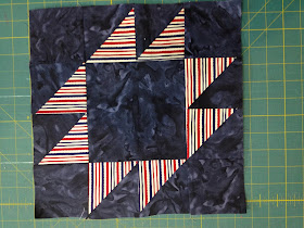
Here is the cutting instructions for the Anvil...

You'll need the following of the "feature" fabric...one 8-1/2" square
From the background...one 8-1/2" square, one 6-1/2" square and four 3-1/2" squares
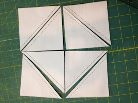
I made my version of a Thangle, scanned it in, and I can print it as many times as I need.  This is just easier than drawing the line across a zillion 3-7/8" squares (which is what is drawn on the page).  So, take the two large squares, put them good sides together and pin the pattern I have here to them.  I can email this to anybody interested.  If you don't use this then you need four 3-7/8" squares of the background per block.  Pin it a few times, and sew on the dashed lines.  Use a very short stitch so removing the paper is easy.
It should look like this.
With your rotary (I really don't care how the paper dulls mine...I paper piece and it is still relatively sharp), cut on the solid lines, making 8 triangles.
Remove papers...this comes off very easily.  And press open into HST's.
Arrange like this, and assemble.  With stripes you can either let the stripe alignment go willy-nilly or let some go vertical while others go horizontal.  Doesnt really matter.

The end result is a nice large pile of blocks to make.  I think this is around 40 or so.  It's going to snow Wednesday so I have a lofty goal to get through half of this! (he he).  If you are curious, the 3yd background I had cut into 26 blocks
Go forth and sew :-)

Saturday, February 01, 2014

New Quilting Edge-to-Edge Designs!

After Last week's nice winning, I decided to go shopping.  It was time, anyways, but in my effort to increase the number of edge-to-edge quilting jobs I do, I have added 11 new paper pantograph patterns to my collection of edge-to-edge patterns.  There's some great textural designs as well as some different looks.  Maybe one will be great for your quilt!