Saturday, March 23, 2019

Quilted Scallop Binding for The Value of Violet

My days are needing a distraction, so I thought I'd get back to the posts I have envisioned to do on the making of The Value of Violet. This post discusses the quilted scallop binding I put on this quilt.
 The nice thing about this detailed finish treatment is that it is mostly done on the machine. That, though is the double-edged sword because some of this process was challenging because of using machines. Often it is easier to "tweak" as needed when doing hand work.
I tried to take photographs throughout the making of this binding edge, but I do know (in retrospect) that I did not capture all of the steps quite as thoroughly as I would have liked.

***added...
When I initially wrote this post, I failed to mention the importance of this step.  When embarking on creating a new (or in this case somewhat experimental) edge treatment, making a mock-up is really important. Below I am showing both the mock-up I did for a previous quilt, as well as the one done for The Value of Violet. At this point in my thinking process, they were very similar. I was unsure of how the narrow lavender 1/2" strip of silk Radiance would behave, in the latter case.

********
As you can see from the first two photos, the scallops are made from several different shades of the lavender fabrics. There are also some done from the silk Radiance (below). I just did not have enough of the Radiance to do all of them. The first step is to determine what size/diameter scallop will be used. The pieces of fabric are cut a bit larger than this, but I always mark a boundary for where the finished seam will go so that quilting does not extend further than there. These are quilted on my long arm -- this is mostly because I find it easier to do, and I am really not a very good domestic machine quilter.
I made 104 scallops. The initial quilting on the scallop just has a cheap muslin on the backside and Hobbs 80/20 as the batting. Each color scallop has a thread that best compliments its shade. I quilted a simple half-flower design on each, after first playing with several other options.

Below, the quilted scallop is seen from the backside (muslin side). The plastic gig is centered on the quilting, traced, and then the scallop is cut out.The soft fabrics distort and stretch some, so using the original marking on the front of the shape is not the most accurate way to end up with a semicircle.

Here are some of these cut out, seen from both the back and the front.

I made up several samples before delving into the actual scallops. The one on the left is just finished as I would have done a previous quilt (Taking the Unmapped Road), while I the one on the right is amped up by the addition of a micro-piping. Adding the piping was complete craziness, but I loved how it completed the look, making it appear more finished. Chaching...this was bound to add at least 50 hours to the project!...
As luck would have it, I had a yard or two of this grape Radiance which had not yet been used on the quilt. I cut strips of bias about 1" wide (if memory serves correctly). The Radiance is wrapped around a piece of very fine cording, and is stitched with a zipper foot using a matching silk thread. I don't know how many yards of this stuff I made, but quite a few.
Next, it is trimmed using Susan Cleveland's trimming tool to have a consistent 1/4" seam.

Now I get handy with the iron and Elmer's glue. Pieces of the piping are glue set around the perimeter of the scallop. The glue is heat set with the iron. You could pin them, but the presence of the cording makes pins a pain in the rump to deal with.
 
I immediately stitch the piping down, again with the silk thread.

The next step is blind. These scallops are backed with the same fabric I used for the backside of the quilt, for a continuous look. I cut 104 "backs" using the same gig shown earlier. the backs are pinned onto the top of this piped, quilted scallop. The pieces are carefully stitched together with a zipper foot. I use my fingernail to locate where the piping is so that the stitched line is right beside it. It is a slow process, and often required going back and moving the stitched line a bit closer as needed.
Turn the scallop right-side-out to inspect, and "tweak" as needed. If it was ok, then a second line of stitching was placed 1/8" outboard of the first. Note, in both cases I am using a very short stitch length and a 50wt poly thread.

 Trim just barely outside the 2nd line. My Karen Kay Buckley scissors are fantastic for this. The serrated edge keeps the cut sharp and accurate. Lastly, create small snips into the curve, occasionally penetrating through the outermost line of stitching. This will ensure that the curve will turn and be smooth.
 Let's look at the finished, piped quilted scallop...From the backside -
And now from the front - 
  The dark purple piping was perfect!
It was not enough to just create perfect scallops. Now they have to be turned into the binding.

I measured the edge of the quilt, going one side of the quilt at a time. A 1" strip of the grape radiance (this time interfaced) was cut, marking the exact length. Scallops were placed along this and stitched on. For several weeks, I puttered with ways to jazz this simple binding just a little, each time really wanting to bring some of the white into it. Call me a nut, but my eye wanted to have a dash of white at the outer edge. I played with using a cording (below). Interesting, but too much finicky hand work was my final assessment.
 I also contemplated adding a scallop of another shape to place in between the purple semicircles. My first go at this plan was using a white satin fabric. I did not have enough white Radiance, and did not want to use white batik. I wanted the sheen.
These were also quilted on the longarm. My first go with this plan proved frustrating. The blue marking pen did not want to come out, and I ended up soaking them, which caused distortion. I just was not pleased with the finished result. I managed to get my hands on some PFD Radiance, and tried again, but when I assembled one of the binding sides, it was thick and bulky. Again, not something I was going to use. Sorry, no pictures of this for some reason.
 For a while it was a veritable white scallop factory.
In the end, I opted to go with the prairie points in white, just as I had done with the previously done binding. I really wanted to have this edge slightly different, but it was not in the cards. I was running out of fabric, steam and time. Life goes on.

So...100 or so of the prairie points were made (again no photos). They alternate white batik and white Radiance, just to get that occasional pop of sheen. These are placed and stitched behind the purple scallops. Then a piece of ~2" wide "facing" fabric (it is the light print above) is stitched to the assembly.
With all pieces together, the grape Radiance part of the assembly is pinned and sewn to the quilt. I had already added a micro-piping to the edge of the quilt. That is why I needed to mark a line (above) with pencil to know where to stitch. This contraption has a good bit of bulk so using the zipper foot didnt work well. marking the piping edge, then following the line was the simplest thought I had.
 The facing was hand stitched to the back of the quilt. It is not perfect. The use of slippery fabrics make for a pretty distraction, but they can be challenging to keep really straight or in place. In the end, I think it turned out well, and mimics the orange peels of the quilt's design.

Sunday, March 10, 2019

Not all Templates are Created Equal

I know that this post is smack in the middle of my series of posts about the making of The Value of Violet, but it has information that just needs to be put out there. Having just taught at the AQS Daytona show, I was able to see a wide variety of templates that the students brought, most of which are <> total crap. OK, being professional here, they are just not the best tool for the job and are wrong for many reasons, which I hope to outline here in a clear fashion.

In my templates classes, I ask students to bring 2 templates -- a straight template and a curved cross-hatching template. Being reluctant to explicitly state which 2 they must bring, I mention the two I have, and suggest they have ones "like" these. I receive no kick backs or discounts from these manufacturers for posting this. Being the template junkee that I am, I have bought many templates in my years of longarm quilting. I, therefore, have purchased some total crap too before finding a couple of really great tools. Those are the ones I am sharing with you, and suggest you invest your money into.

Straight Template

Let's face it, these templates are not inexpensive. This one sells for $22 at The Gadget Girls. In the scheme of templates, that cost is pretty good. It is called Janet-Lee's Favorite. (and there's no kickback from Janet-Lee to promote this template just because she's my friend!)
I know, you are wondering why I like it.  First, it is not because it is bright yellow. I like that it has a color, because you don't lose it, but I honestly prefer templates with a soft, subtle tint more like the ones I designed and sell on my website. The yellow, though generally fine, can be difficult to see through on certain color fabrics. For the most part though, this is my go-go straight template.

Why?
1. It is a perfect size. 3" x 10". Anything wider than 3", and it's a total handful to hold. The 10" length is enough for most lines I need to quilt. Any longer, and it will far exceed the length of the base plate (which is there to support the template), and you will risk having the template teeter (yes that is a word!) and potentially hit the needle. You know what that means. <> The needle hit the template while I was not completely paying attention. Doing this can foul the machine's tension.

2. See the many etched marks on this template?...Exactly, there are NOT a multitude of marks. There are only the lines that you really need to do line work and straight crosshatching. There are no numbers, excessive text, unnecessary corporate logos. There are not twenty cross lines. IT IS SIMPLE, because simple is better and easier. I am resisting the urge to show you photos of other templates, ones that are wider than 3" and with so many markings they are a confusing enigma of which marks to use. I want you to just focus on the notion of "minimal". It has 45 degree etched lines for aligning an on-point grid. If you want to do a 30-60 grid, get out your protractor to set the position of the first line.

3. No 1/8" markings. While I personally love to quilt 1/8" spaced lines (corduroy as I call it), I do it with this very template. The evidence is clear -- it is simple to do, and I can execute these very accurately (the evidence is below). I simply start by quilting two 1/4" spaced lines using the etchings on the template, then I place a third line in the center between these lines. Now, you can quilt as many 1/8" spaced lines as you like simply by using the 1/4" etchings. It is not that I have not purchased a template with 1/8" etchings, because I have. It is because when a template has that many etched lines, you can hardly see what is beneath it. Coming from the perspective of the beginner quilter, having better visibility is preferred. Consider purchasing a ruler with denser line etchings after you have successfully mastered using a template similar to what is suggested for these classes. Minimal...think minimal.
(from The Value of Violet)

4. No Handles or additional "holding tabs". The notion of a template having a handle always seems good initially. I fell for it too, buying about $120 in handled templates, only to get them home to discover how much I truly hate the handles. They seemed awkward. It increased my tendency to not keep the template flat. Remember, a tippy template is a template that will soon come in contact with your needle. While I occasionally meet quilters that like the handles, the consensus of much of my Daytona class was that they were soon to be replaced with flatter templates. With any template, especially ones with handles, just follow this advice. Buy one. Test it at home for several hours before purchasing the entire set. They are not bad, but they are not a style I like or can endorse. Discover for yourself if you like them.

5. No special additional shapes or things to aid with ditch stitching. While it is an eventual certainty that you will probably stitch in the ditch with your straight template eventually (they are not just for quilting corduroy!), I am a firm believer that you will adapt to knowing how to spy that 1/4" offset between the edge of your stitching and the needle. The template below on the upper left has a notched area on the right intended to help you with doing straight ditch stitching. If you place the central line on the tabs on your ditch, it will automatically offset where the needle goes so you stitch close to the actual ditch (assuming the seam is in fact really straight). It has a great intention, and I do know many people who appreciate this function on a template. But for me, I dislike this multi-function template because it just does not feel good in my hand. It has a ton of pointy edges, and the length of the straight section is inadequately short. My 3"x10" simple template is smooth and comfortable in the hand.
Not yet convinced? Ok, I understand. I had to purchase about 4 templates like this before I realized that I love my Janet-Lees Favorite most. I'm just attempting to put out my reasons for why I like this best so that my MQX students who have not yet bought their templates for next month's template classes know what I'd suggest, and why.

Let's move on to the next template. 

Curved Arc Template

At some time in every quilter's life, he/she needs to have a good curved template for quilting curved cross hatching. This is not to be confused with a template that quilts circles; that actually does need to be a circle, rather than an arc. 

Curved cross hatching looks like this - it is basically a grid but the lines are curved.
When you have mastered the simple, there are lots of gorgeous variations of curved cross hatching that you can learn, Cathedral Windows being one of them (below). This type of design is where my recommended arc template makes the process doable.

As you know, there are also as many curved templates on the market as there are straight. The one I stand behind  as a quilter and a teacher is called the Boomerang, and is sold by Deloa Jones. It has an arc on both sides of the template, as well as etched concentric ARCS. I'll tell you why having 2 arcs is important shortly. These Boomerangs come in several diameters, so be sure to select the size suggested. For new users, I like the 8", 12" and 16" (but you know me, I do have a few others too, they are THAT good!).

(Deloa Jones Boomerang)

Let's talk about the etched lines. They have to be curved. There are more templates out there similar to this that have straight lines or a straight etched grid on them. They are essentially useless for curved crosshatching. If you just want to quilt curved bumps, then fine. This template has several etched lines too. I saw a template last week that had just one etched line, which means that you can only quilt 1/2" spaced arcs. It seemed pretty limited.

This template has a central perpendicular line too. I marked it with pink on the above photo. This is to help you keep the template aligned when quilting a grid. There are 45 degree lines, but if the template were mine, I'd have left these off. I can't say I've ever used them.

Now let me talk about the two curves. Unlike some similar templates available with 2 curves, these two curves quilt exactly the same shape! Genius, huh? They  don't look like the same curvature. Well, they aren't. The inner is 12-1/2" diameter and the outer is 11-1/2" diameter (the 1/4" distance of needle-to-hopping foot makes them both quilt 12" arcs). Having two different curves capable of quilting the same shape enables quilters to quilt the left part of the arch (below) with the inner curve, which is more stable.
 And then they can quilt the right part of the curve with the outer curve (below). It's not rocket science, but it sure is smart and clever. Nobody has to cross arms unless they feel like being a contortionist.
Now, because the template has 2 curves, if you were quilting the area beneath the arch with a crosshatch, you'd use the inner curve. If you didn't have an inner (lower) curve, well, you couldn't create the cathedral window.  Sometimes I prefer to curve crosshatch the area between the arches, and in that case you will use the outer (upper) curve.

In my Creative Templates 2 class, we learn about cathedral window motifs, so having a template like this is imperative. In Templates 101, we also do the simpler curved cross hatching. You don't need to have the lower side of the template curved, but your template does need several etched concentric arcs (at least 3 that are 1/4" spaced apart). My theory is, though, once you learn to do the basic curved crosshatch, you will most likely want to learn to make cathedral windows, so consider purchasing the best template from the beginning. This is one of those times when my experience can be a favor to you. 


Tuesday, March 05, 2019

The Value of Violet...In the Making (post 1)

All my life I have had this love affair with the color purple. I love this color and all of its shades -- lavender, plum, fuchsia - they all just speak to my passion for this quilt. I'm not sure that this originally intended to be a one-color quilt in the beginning, but it rapidly turned into that. What I learned in this process is that these type designs are immensely challenging. I have always used a variety of color to convey movement, or depth. A chosen "pop" color helps to move the eye around the quilt. I still wanted to create a quilt with these same characteristics, but was forced to use the values of the single color to do this.

My quilt, The Value of Violet, debuted at the MidAtlantic Quilt Festival last week. This is my new quilt for 2019. Over about 11-12 months, I worked on the quilt so it is fun to finally get to share the entire thing. It finishes at about 71" square, and is made from both commercial cottons and silk Radiance. As you may know, silk Radiance has been out of production about 20 months now, but fortunately for me, as soon as I heard production was stopping, I purchased about 50+ yards in a variety of colors.
This post will discuss the making of the top.

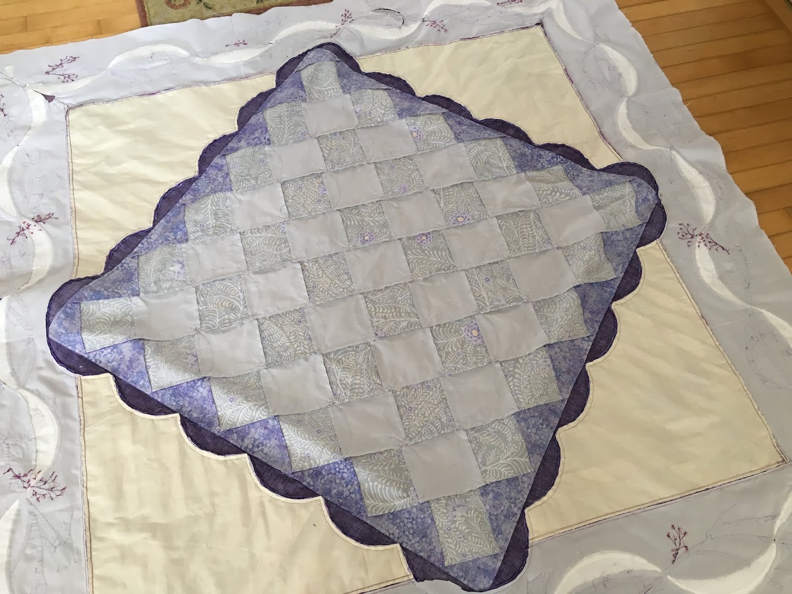
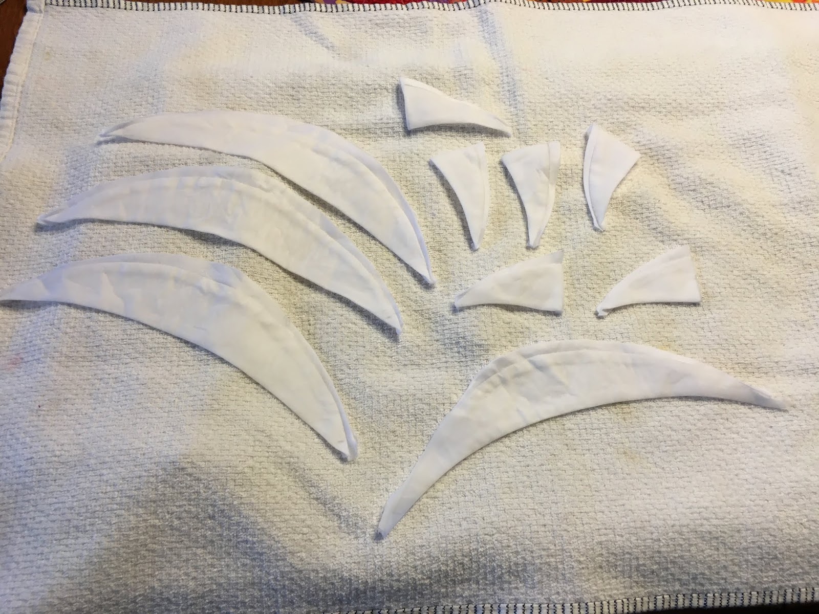
In December 2017, I decided I wanted to make a modernized version of the Pumpkin Seed pattern. I had 3 shades of the hand-dyed purple silk Radiance which was barely enough to cut out these petals. Debra Linker (a fantastic dyer) dyed these for me for another quilt the year before, but somehow my interest in finishing this quilt waned, and I was left with some of the fabric. I am probably considered a hoarder when it comes to fabric, not throwing away even the smallest scraps. That came in handy this time! The background is the simple pieced checkerboard of silver Radiance (a stock color) and this Kaffe print that was actually bought for something else. The two silver fabrics just happened to match nicely.
The applique bits are all turned edge using the startch and templar method. It does take what feels like a proverbial lifetime to get them turned but once they are prepared, I can take the pieces anywhere and stitch them. Weeks later, the edges are still crisp. At the time of this photo, I was still auditioning layouts and playing with the pink dots. It didn't end up quite like what is above.

I have put the lightest lavender fabrics at the center, and the darkest at the outer edge. This creates a pretty glow from the center of the quilt. Because I chose to applique over the seams, when all petals are stitched down, I went back and snipped away the seams from beneath the petals. There is nothing more unsightly than to have nice quilting over the lumps of the piecing.
Originally, the center medallion (above) was going to be set on point, and there were going to be rather sizable appliqued corners (shown below). I remember thinking how daunting all that applique was going to be to prepare, and it was subsequently modified. I'm not really sure though that the design I switched too had any less applique!

 The applique is whimsical, and less realistic than my last quilt. It's hard when all of it is from the same color. Leaves and flowers were all purple. Floral applique is much simpler when there are many shades of green for leaves, and other bright colors for the flowers. a single color scheme poses many more challenges than I initially considered.

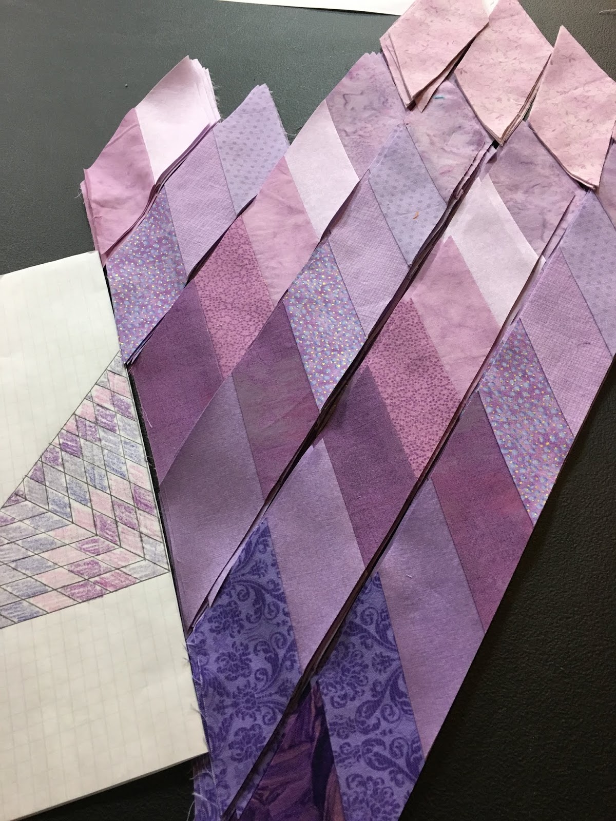
When I ditched the large applique corners, I had to go with pieced corners. The diamond piecing is a bit of a pain, but it is great when you only have a few inches of any one fabric. I tried to work in a couple of the lavender silks, for that variety in sheen, as well as a pretty gradation of darker to lighter purples. By themselves, the colors of the corner seem a bit odd, but on the quilt, I think it twinkles.

(doing a layout test)

The biggest problem with these corners is that the outer edges are ALL bias. I had to come up with a way to put this all together so that it wasn't a stretchy mess. Here's what I did.
 I cut a piece of muslin in the exact size needed the finished square to be. The corners were carefully basted to the muslin, forcing the outer edges to be square.
I wanted to use this 1/2" fuchsia border, but knew it would only work if it remained very straight. This construction method seemed unorthadox, but I knew it would accomplish my goal. The tiny border was pieced into place, attaching it directly to the muslin-basted square.
Next the center medallion is carefully centered on this muslin, and basted to heck and back. How do you center it?...Guess you won't accept "carefully" as the answer. I place it squarely on my wood floor, using the boards to keep it straight. Using a laser and measuring tape, I tweak the medallion until the alignment is straight. There is no easy fix later if this is not right. You can't exactly ask the viewers and judges to "kindly cock your head sideways 3 degrees when viewing". LOL!
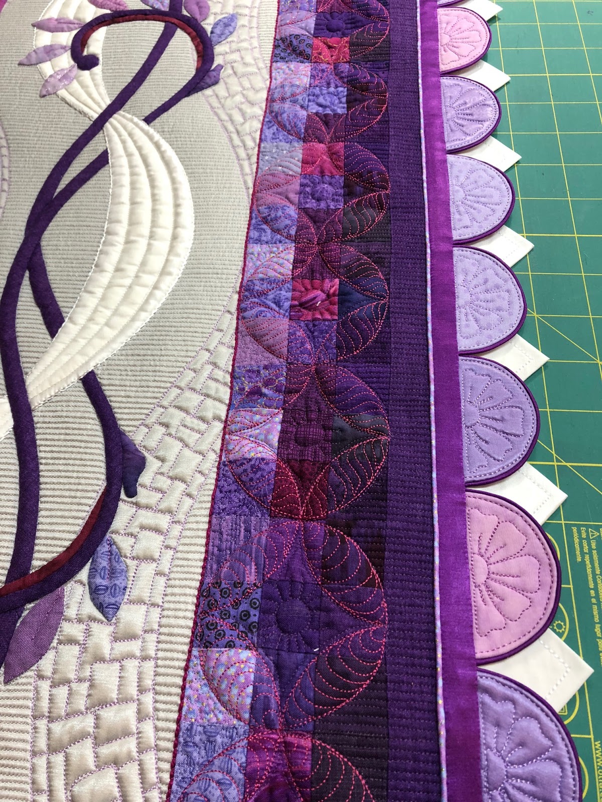
I added the deep purple scallops. They are left raw edge because I covered the edge with the magenta bias (below). I also tucked a piping under the outer edge, but I can't seem to find a photo of this before the quilting was done. 4058 photos of this quilt, but not one of this. Go figure...what were the odds!
This shows the piping... (pretend you haven't seen the quilting!)
I machine appliqued the bias edge to the scallops using a clear thread, then carefully stitched the entire medallion to the background via the ditch by the piping. The last step is to remove the muslin that was used to keep everything perfectly straight and square.

This shows the muslin removed from the center (above). Below, I cut it away from the pieced corners. There is a tiny ridge ~1/4" wide where the seams are that you can't get rid of completely, but that is ok. What I don't want is to have the muslin shrink should I need to do a hot soak (if a fabric were to bleed), because the muslin would shrink more than the other fabrics.
 Here's my fancy-shaped cutaway of muslin...
On to the applique borders...

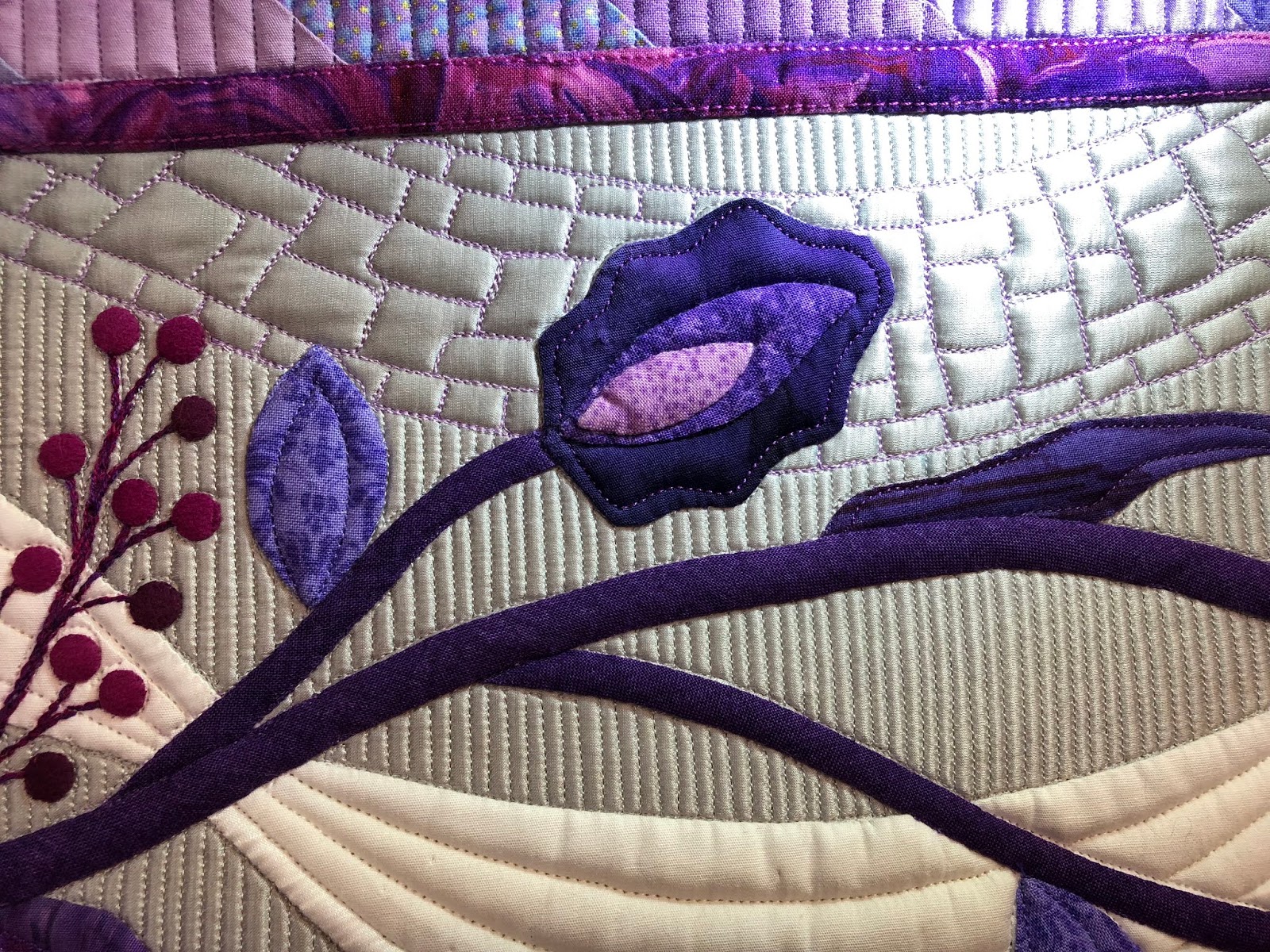
In all truthfulness, the design of these was ongoing as the work just described was being done. I drafted the  pattern on paper. Like the last applique quilt I finished (My Secret Garden), all four sides of the applique are different, and there is an intended top and bottom.
I create "patterns" of the key shapes (main leaves, flowers, etc) and they are traced onto the serpentine vine. At some point in the design, I decided I wanted a ribbon to intertwine behind the applique, so it was added. The only color that made sense for the ribbon was white.
 These ribbon sections were made from white batik, and had an edge of the white silk Radiance. I just didn't have enough white to make them all from the silk. The bothersome part though was that the gray fabric shadowed through the white batik.
 So I added a rather heavy fusible interfacing, fused across the entire back (below).
I used an Elmer's glue to position the silk and batik pieces, so after it was stitched, these went into the sink for a quick bath.
And air dry, then re-iron... because they were a tad puckery. I hoped once quilted they'd be flat. Why do all quilts seem to be somewhat experimental??!
Each of the 4 applique borders was hand stitched individually, before they were added to the center. When they were complete, I soaked them to remove glue and starch, and blocked them on the foam core boards back to size. The handling of being stitched as well as the bias vine can make these (when appliqued on silk) want to distort a bit. Blocking recreates a perfectly flat quilt which is ideal to have before quilting. The only thing not done on these borders is the applique that is on the corners.
The "greenery" I designed for this quilt is different from other floral applique I have used. Leaves still look like leaves, but I added that deep plum pod-like shape and the modern-ish "flowers". I knew it would all read as "floral", but I was going for different. These three flowers (shown at bottom of borders above) were intended to mimic the shapes of the pumpkin seeds of the center. Clever?...well, no...it was sort of planned. I do that with the quilting too, but you'll have to wait until the next post for that.
(slight bleed)

This was the first time I have used faux suede. I never knew how fantastic this stuff is -- no edges to turn, no circles to manually cut. The 1/4" berries (nearly 300) were cut with circular punches than hand appliqued.  One firm whack of the hammer and you have a microscopic circle! It was good for kid-raising stress-relief too. The vines are appliqued with 2 color of floss - magenta and purple. Truth be told, one of these embroidery threads likely bled. I used a floss that I have probably had since the early 1990s, and I suspect it was that. I thought it was the right color, so I used it. Bad deal!...Toss all your old flosses!! If it weren't for the white ribbons, the bleeds might not have been seen, but it's in a few places, subtly.
Viola! Here is most of the top. The corners are pinned into their square positions (yes, with the aid of the magical aligning hall flooring and a rotary cutting square. The remainder of the applique that covers the corner miters is hand stitched.
But of course, I was thinking two steps ahead of where I actually was. Before the applique was actually done, I was playing with how to do the outer border. I knew that the quilt needed more beyond the silver silk to properly ground it. I wanted to bring that very deep purple of the scallops to the outside of the quilt. It's about moving the eye, and color was my only tool to do that.
The one inch squares are simple, but colorwise effective. No rocket-science or extraordinary measures needed. Just a dark plum border. There were a few of the magenta squares thrown into that outer border to pay homage to that shade as well.
Now, I needed to decide on what fabrics to use on the 3/4" circles I was going to applique to the points of the pumpkin seeds. I had a small piece of this Celtic print that I have been hoarding forever. I love this, and thought since I used it on the corners of the white ribbons, it would be perfect to reuse on the dots.

 They were more than a bit pesky to align just so. Many naughty words were said for each I had to remove and straighten!
 Three or four other shades were also used on the dots, from darker at the outer to lightest near the center.

This is essentially the finished top, as it was when I loaded it on the longarm. I added trapunto, quilting, embroidery, couching, some pearls and more (yea, the crazy quilted scallop binding) as the process continued!
Stay tuned...the next post in a few days will discuss the quilting!