Monday, February 12, 2018

Its a beautiful day in the neighborhood

Here is another stinking cute wall quilt sent to me by a long-time client. It's about 42"x42" and has some cottons and some wools for applique.  For lack of it's appropriate name, I call it the Neighborhood quilt.  She sent a thin cotton batting, but I added a layer of wool to really pup the appliques. Additionally, these reproduction prints are known for being "busy", and busy prints hide the quilting designs.  Having added batting makes the relief of their quilting designs that much more visible.
I pulled a soft yellow variegated thread by YLI for the background. The rest of the houses got either pink, green or purple thread - whichever type matched best. Although it is not really visible, there is also some stitching in black on the windows and doors.  I just wanted to give the appliques some definition -- window paning or an echo on the door. 

 The stitching on the houses is often very simple, so as not to compete with the prints. Linear designs are usually better for these fabrics.  Every now and then, though, I threw in a brick or block pattern though.
 I just love the scalloped roofs. These are freehand clamshells. Most of the designs are detailed in my Dense & Dainty book.
 Making some of the lines go horizontal, while others are vertical makes the houses more visibly interesting.  When there was room, puffs of smoke was quilted coming out of the chimneys. It is a whimsical village with hints of realism.
One last pink house...
 Backs are always fun to see when they are mostly solid.
  
Today was a "fun" day, and I use that word loosely, packing up teaching things and books to ship to Virginia. I have a whopping 140lb of stuff, AND I plan to check 2 very large suitcases. Teaching 6 classes takes a heck of a lot of stuff. I have a bit of prep still to do for one of my new classes, but the others should be autopilot by now!

This weekend I get to shift gears and help my daughter quilt her newest quilt. All I can say is thank goodness it is nice and small!


Tuesday, February 06, 2018

Client Medallion Quilt

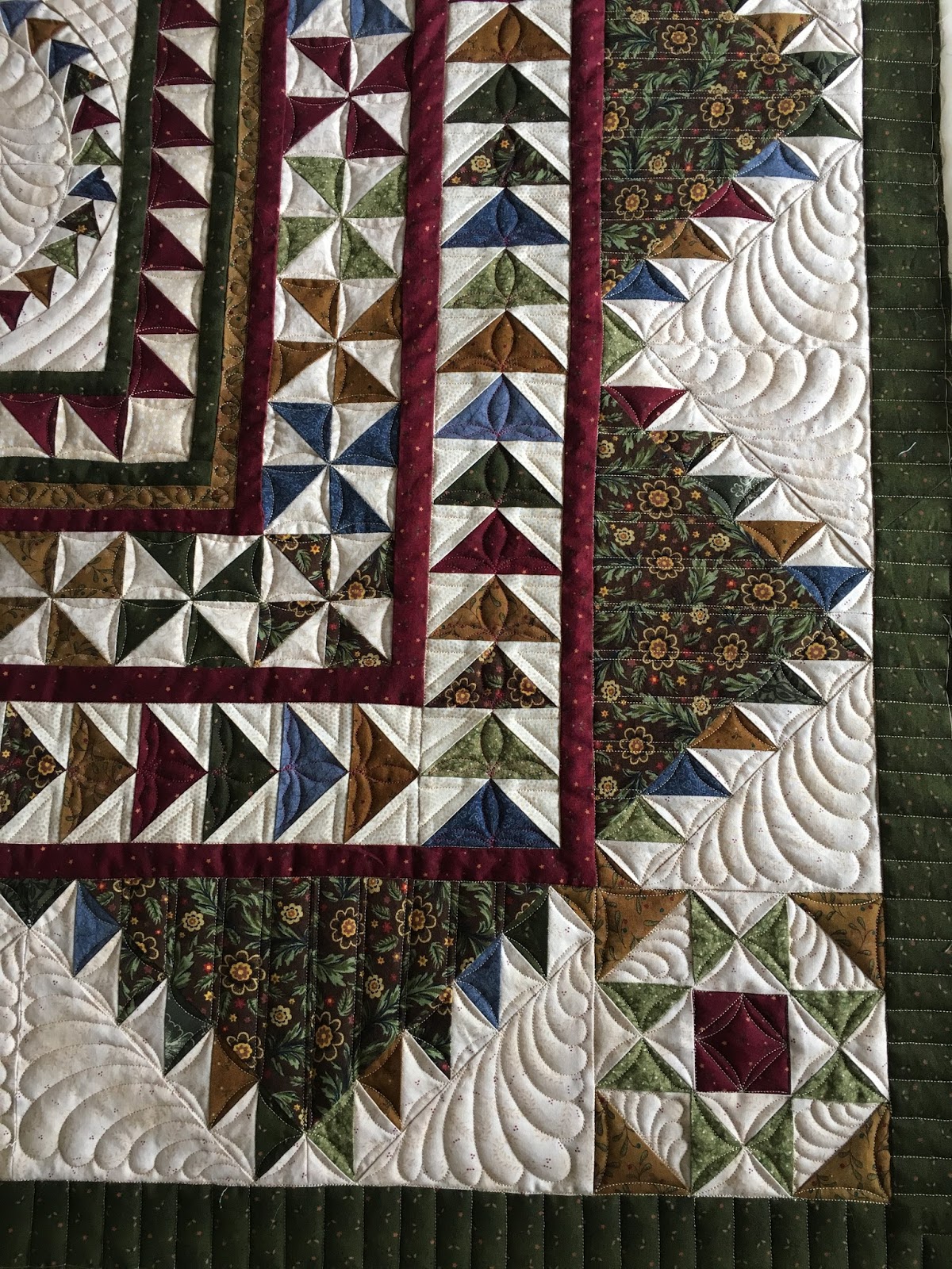
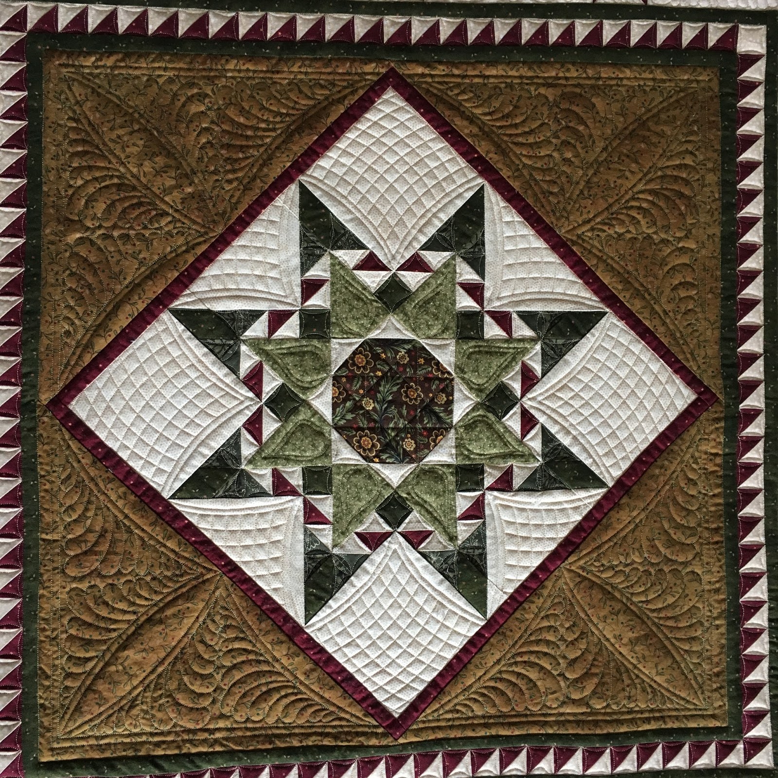
 My client Doris spent much of last year piecing this quilt from the Quilt Show. It is a medallion style design with a whopping 17 borders!  There are more 1/2" narrow borders than I care to remember, and miraculously, it laid pretty straight and square after I was done quilting.
Here are the threads I pulled for this job. Most of it uses this tan Magnifico thread. It showed just a tad on all the ivory fabrics, but not too much. The other two colors were for more localized work, when the tan was just too light. They are similar to the Magnifico -- Glide.
The quilt has a single wool batting. Though Doris plans to enter it in the Vermont Quilt show next year, it will ultimately go on her bed. Double batting just to enhance the quilting for one show seemed silly. Most people don't want a double-batted bed quilt. I'm the rare exception because I am always cold, and I just love the added weight.
I tried to maintain some consistency of patterns from row to row to row. There are several places where the continuous curves are used. It's not because I couldn't think of something different, but because they do work nicely, they are continuously quilted, which makes it a cost-efficient motif to use when budget is a concern.  Places that benefit from more time-consuming designs, like these rounded geese - well, that is where I put more time. It's all about getting the most bang for your buck. Spend time where it will show. The feathers are pretty; most clients like them. But for me, they are not usually an overly time-consuming element. The crosshatching, on the other hand, does take more time. Together, though, they are a nice combo.
The same is true for feathers and linear work. Nice together. The feathery fill (above) around these stars is not the fastest, BUT I am able to quilt the fill and the ditching around the stars and the details on the stars continuously, without stopping. THAT to me, is reason to choose this. Stopping and starting is like the devil's work. No thank you.
 You always seek to create a center motif that has a little drama -- something to draw the viewer's eye to the middle of the quilt. There's a little bit of feathering, a little crosshatching, and a little continuous curves. Repeat, Resize, Reuse. It may be hard to see, but I quilted on the tan print with the deep green thread, just to make these feathers show a little bit more.
 ...and a little more close up.
The little rings of geese were initially like this, but I decided that was just not right. I don;t really like the puffy goose look, and I didn't have time to ditch and backfill around all of them.
I came back with the red thread and did a small-arc continuous curve design through the geese. It's just enough to lay it in place better.
The larger geese also got a similar design. These are probably 2-1/2 or 3" geese, and again, I did not have budget to ditch all of them. This ribbon-like continuous pattern quilts relatively quickly (and by quick, I mean probably an hour to do the entire loop of geese!).
So, I hope Doris likes her quilt as much as I do. They always undergo a transformation when they convert from flimsy to quilt! I love the grand reveals.

Here's my shameless plug...If you'd like to learn how to quilt all of the feathery motifs shown on this quilt (and dozens more), they are all individually shown in my book (available from the link on the right sidebar). They are fun and beautiful, and can be learned by all quilters.
Happy Tuesday...Quilt on!

Monday, January 29, 2018

New Client Quilt - The Tree of Life

I feel like I should know who the designer of this 69"x79" Tree of Life quilt is, but it escapes me. It was made by my client, and has lovely turned-edge applique. The amount of brown grew on me - LOL! It is a beautiful mix of traditional motifs and more Jacobian floral designs.
I tried to keep it more traditional, putting feathers in the border, and throughout the center panel.
Marilyn sent wool batting, but I added a layer of 80/20 underneath to really pop these appliques. She is hoping to send this to the Vermont quilt show.
Because the flowers are playful, I allowed the quilting designs in the clamshells to be a bit playful too. These are stitched with a rust Magnifico thread. The center is with my favorite YLI polished Poly.
Floral borders (this is ~4" wide) are challenging because feathers don't show nicely. Usually a linear pattern is most effective. I like the 1/2" lines.
 Oh, such beautiful texture...
Here is another shot at the center panel. The birds are whimsical, as are the flowers. It is pretty to give a flowing background of strategically placed feathers to help the eye move.
Hoping my client likes her quilt :-) ...on to another one.

Wednesday, January 10, 2018

Another Client Beauty

This sweet quilt was sent to me by Doris. It is a Sue Pelland pattern. Though I had a somewhat restrictive budget, I attempted to get the most quilting for the value. Each row of the middle section was very important to be stitched continuously so that I could both outline stitch the orange peels, as well as provide prettier fills.
 She sent me a grainy photo of how she'd seen this quilted, specifically requesting rolling feathers on the alternating corners. This border is like 10" wide, so these are large curling feathers.
 I used a variegated YLI poly thread I have had for ages. It has the reputation of occasionally being persnickitty to quilt with, but happily it ran just fine. It looked pretty on the beige batik because it brought a subtle amount of color. Doris sent the flattest of flat battings, Warm & Natural, so getting relief out of the quilting was not happening. I wanted the color of the thread to at least convey the designs a little bit.
 The orange peels are all fused with the absolute lightest weight fusible. They are not stiff at all. They are also blanket stitched.
I am busy getting my SH*t ready to travel next Wednesday to southern California. The fact that I am going to a place that is 60-70F has been like a blinder to hide the amount of work I have to do from my eyes! It finally hit me today how much of an idiot I may be. The show will pay for 2 checked bags, so I did not ship everything I could have.  Now I am seriously pondering HOW will I manage 2 checked bags AND the one I plan to carry on (which contains all the backings and tops for the 1st day)! ...plus one change of clothes in the likely event my other bags do not make the two connections!  Sheesh...I must be nuts. I will have darn near 125lb of stuff, and I have a 6am flight to boot. Shoot me now!

Today was dedicated to getting the applique borders marked for this quilt.I am still assembling the flowers and leaf units for it, but it's getting close to basting the pieces onto the borders. The grayness of the border will be tempered when all of the applique (purple) is added. I think it will tie together with the center too.
The center section got it's scalloped frame too. I am awaiting delivery of a rose fabric that will be used as a bias piping around the scallops. Leave it to me to always love the discontinued fabrics. It was a beast to locate! I'll likely machine applique that on.
Now, just a 3-4" pieced outer border to design and it will be down to the assembly. And, of course, figuring out how to quilt it so that some of the quilting actually shows!

Sunday, January 07, 2018

In Design Mode

 It's no secret that I love Carpenter's stars. The simple pattern of triangles, combined with just the right gradation of color is always attractive. I have made 3 of these quilts previously...one that I won't show anybody (it hangs at my mother's house, and it was made before I realized many technical details about quilts!), and the next two.

Zen Garden will forever be one of my favorites. It had that surreptitious perfect blend of fabrics that I still love. All of these fabrics were in my stash at the time it was designed and made.
A couple years later, I started another carpenter's star. It spent a while in a box until I endeavored to finish it. Illuminations (2016) is all batiks, and just never met my current-day aesthetic. I still wonder why on earth I chose all the blues.
Despite having a quilt or three started, I have been day dreaming about making another Carpenter's star quilt. Like seriously...when has numerous started projects EVER hindered the starting of another?
I sat down yesterday with EQ7 and started playing.

I will preface this by saying that EQ is NOT user-friendly for this type of pattern.  The 4 "mis-matched" sections/holes are there because this is the best rendition I could create with a program I still hack my way through. It's good enough for my purposes, though, since all I really want to do is play with color placement and ideas for the setting squares.

Starting out, my goal was to create pieced diamonds that were in greens and turquoises, and then put applique blocks in a complimentary color like orange. How I got to this design is a bit of a mystery.
 Twenty-four appliqued blocks should keep me busy (and probably bored) for ages. What I found fun was to play with the frame and background colors, in search of that perfect combination. Somehow, I always gravitate to the purple.
Then I removed the outer frame, thinking this would reduce the size a bit. Did the frame look redundant?... I may also investigate adding more leafy applique in those corners.
 The lighter frames brought a different look. I kind of like it.
 ...or maybe a slightly softer shade...??
 Nah, deeper has more power. Now I'm cooking with gas.  What you will notice, is that initially I always go to a neutral background color of soft taupe or sage. White and ivory are just too stark and are waiting to be bled on. Soft green usually feels right.
 But then I inadvertently changed the background to my nemesis color -- brown. It is no secret, I hate brown. It is only marginally easier to work with than black, and is just well the color of bark. Or dog turds. Bot, wow!  I mean WOW!  This design just hit me as powerful. I tried hard not to like it, but it may be growing on me because it makes all the quilt's other features pop. 
I fiddled with using two shades of brown. This has a lighter outer area. My thought is that this may be easier to see to quilt on.
 Then I played with lighter on the blocks and darker in the background. Interesting. These both had frames that were read. I never really thought I loved red and brown together, but maybe I will ponder that a bit.
 Maybe I am more of a pink gal...Yes, this I like better than red. It is sassy, and I like it.
 This has a little more color.
 Two shades of pink?
 Pink and orange? It just makes me want to run to my favorite online shop and buy 16 yards of brown fabric. LOL!  It is very colorful, in a happy way. I don't have the faintest idea how I'd quilt brown fabric, but I know I'd be adopting a newer more-colorful language doing so.
First I must ponder a couple of client quilts, get my purple applique quilt pushed a little further and then maybe I will pull some fabrics and actually ponder making this magical mandala!

Thursday, January 04, 2018

New Book Release!

Without further wait, here is the book I have spent the last several months writing. It has been a project in the works for several years, as a variety of feather content has been drawn, quilted and now, finally, written into book form!


The book is for new quilters who have not yet quilted feathers, as well as those that have some feathering ability, and desire more. I cover quilting feathers from the ground up, showing many varieties of feather that you may customize to either your personal taste, or the design of the quilt. I discuss ways to place serpentine and twirling feathers onto borders, as well as more specialized borders.  Dozens of designs are included for quilting feathers into common shapes like squares and triangles.
 There is an entire chapter devoted to feathered wreaths as well.
If you are interested in quilting feathers into background spaces, or in lieu of a pantograph, this is included also. Unfortunately because of book size, I withheld a chapter on narrower feathered borders, but this can be found in my Narrow Borders book.

Please feel free to spread the word. This book is available on my website and from me at the select shows I teach at.  It is 88 pages of color instructions, photographs and illustrations. The cost is $25.

Tuesday, January 02, 2018

The woes of quilt construction

Unless you are making a quilt that is just sashed blocks, at one time or another you may have (or may will) encounter a design that makes you stop and scratch your head. What I am working with is like the EQ rendition shown here. On the surface it looks pretty straight-forward, but upon deeper study, it is fraught with potential issues if constructed incorrectly.
The center is simple. It is just a square (mine is pieced), and petals are appliqued onto it. It is then rotated 45 degrees to be on point. No rocket science yet. What had me perplexed though were these diamond-pieced corners. As usual, I had these four units pieced before I stopped long enough to realize that this design was a potential train wreck waiting to happen. All of the edges of these diamond units are bias! I know well enough after making 3 lone star quilts to handle these corners very carefully, but it would only take a small bit of stretch to make the lines of that fuscia inner border look crooked. I thought at first I might be able to just stay stitch the edges and then attach them corner by corner, but then I wizened us and devised a better plan. Maybe you have a quilt in the future that this technique could work on.

The way to get the most visible part of the design (fuscia 1/2" inner frame) to appear straight is just to piece it straight.  I carefully cut a 47-1/2" square of good muslin. I used this as the foundation for the diamond units. Each unit was machine basted to this square, as I did below. Now, all edges are stable, stretchable, and all that good stuff. I also have a completely straight edge onto which to sew the fuscia border.
 With 1/2: fuscia border added...
 Here's a closeup of the edge, with mitered corners to match the diamond piecing.
This center section is not ready yet to be added. In fact, the silver outer borders that will be appliqued will be added first, but you get the idea. The only wildcard in this construction is whether I can center the orange-peel center medallion (and two lasers and a good eye say that I can). It will be appliqued on last. But I know that when I do get to this step, the rest of the quilt will be in perfect alignment.
When the center is appliqued down, there is one final thing that should be done. That muslin was not prewashed, and is very likely to shrink at a faster rate than the other fabrics. I will cut the foundation out of the quilt after it is mostly assembled. To leave it is to risk having it pucker disproportionately if this is ever put in hot water.

Have a great week, and hopefully this construction tip helps you out of a similar bind one day!