Wednesday, August 10, 2011

Intertwined - detail pics

I showed this quilt 10 days ago after the show, but didn't realize I hadn't really shown too many of the detail pictures.


Turns out, I really love this quilt. I love the batiks, and the purples and greens. They are 100% me and then some. I started this center block last August in a Karen Kay Buckley class on hand applique. Her class was fantastic. I can't say enough about her patterns (but they are hard and time consuming). If you follow through with the applique of one of her's, you'll definitely see the improvement in your technique by the end of it. She has patterns for a quilt with 6-9 leafy wreaths with different flowers and an absolute TON of grapes. I knew after doing the center that I wanted to do more, but I wanted to make it my own design. The vines are needle-turn appliqued from 3/8" bias cut strips, and then are stuffed with a piece of yarn. Can you say, "Very narrow!".

So I added the appliqued ribbon and cathedral window. And more grape vining with the orange flowers that intertwine, hence the origin of the quilt's name. The quilting is traditional and symmetrical, whimsical and fun. I put hidden quilted flowers in the border and no shortage of feathers. I wanted texture, everywhere. There is curved cross-hatching -- something I have grown to love. I made it look more basket-woven this time. Did I mention that there are nearly 150 appliqued circles that are all under half inch in diameter??


For those of you that longarm, this quilt has a layer of Hobbs 80/20 with a layer of Hobbs wool atop that. The thread is Superior SoFine on the top and Bottomline in the bobbin. The filler for the rays in the quilt's center is done with the Bottomline as well. The cathedral windows are stitched with a plum-rose variagated Rainbows thread. Although the pictures don't show the subtleness of the thread colors, the feathers in the center are stitched in lavender thread so that they'd show a bit more. The rest of the threads match the fabrics - mostly Hoffman 1895 batiks.

Though you probably can't tell, the quilt is also adorned with nearly 1000 Swarovski crystals. It glistens under the show lights. I tried really hard to give the quilt a great backing as well. I was tremendously bummed to find that I had missed centering the diamond by about 3/4". It's fortunately not really obvious! When this happened, I kind of suspected it would have a short show-quilt life. But receiving a blue ribbon has made me rethink that. It will be visiting the Georgia Quilt Show in October next, for those of you in that area.

It's 42" square. Could be a perfect size to hang in my dining room. If only...


HE doesn't love it here (like the new dining room was designed for anything else in this spot??!). Thinks it is too large. I think he's crazy. Real Crazy. Even crazier than the fabric-crazy, quilting obsessed wife he has. The wholecoth quilt I have been marking this week may go in this spot instead. Time will tell. It may well be on the show path for a while anyways :-)

Monday, August 08, 2011

Projects and more Projects

In the spring, I took an online wholecloth class at www.MQResource.com. I have mixed feelings about the class, but there were definitely some things learned. Several months later, I am starting my own wholecloth quilt. I worked on the design during the class, had it enlarged a month ago, and even bought the silk Radiance fabric a month or more ago. Once it arrived, I was too timid to touch it. It's silky, sheer, and will not tollerate pick-out so I have to stitch it correctly the first time. Now, that is daunting!
So naturally, with at least 3 other projects started, I decided to lay this out and start marking. It's not my nature to actually mark all those feathers. I thought long and hard about just going at it free-hand, as that is my nature. But I figured I'd follow the suggestions of the class just this one first time. As it turns out, this champagne colored silk is sheer enough that I don't need a light box. I can pin the fabric to my 36" pattern and trace away!

Now, off to pick out a binding and redo it with a piping. Yikes, that sounds like a TON of work!


Saturday, August 06, 2011

Detailed Pictures, as Promised

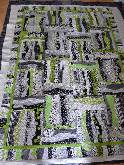
As promised several days ago, I have additional pictures of the 2 quilts I quilted for clients that were shown at the Maine Quilt Show. This first one is by Kathleen Currier and was a display quilt. It's a wildly bold and modern design, and despite absolutely loving the color lime green, I found the design very difficult to do. We wanted to quilt more than a pantograph since it was going in the show, but when the top does not have a definite focal point, it makes stitching a custom more challenging. Additionally, the fabrics are all mostly quite busy, and seeing the thread was hard.
Lucky for me, she is a fantastic piecer. Even with all the curves, it layed perfectly flat. What I chose to do was a little unorthodox. I cut circles out of a poly batt to place under the appliqued circles to give them added poof. I then stitched a row of pebbles around the perimeter of the circle to hold them in place, and amplify the poofy-ness.

Along each waving strip, I stitched a variety of different fillers ranging from classic feathers to swirly feathers, pebbles, flames, waves, etc. I also used different color thread - green, black, white and charcoal. Originally, she had a patterned background, but I convinced her early on to go with a solid color to show off the quilting. Hanging at the show, you'd never know how much quilting there really was. The poor white glove gals practically stood by this one much of the day I was there, holding up one corner so people could see the back!

...which was really quite unexpected.


It's wild like the front, and shows off a real avant gard style of quilting.

.

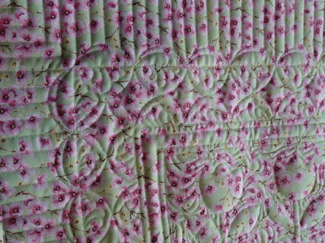
Here is Jaki's quilt, which won a red ribbon. It's a smallish wall hanging, with impeccable applique. The background is all filled in a McTavish-esque style. It was hard to do anything but an "all-over" filler because the applique designs are not separated much. The dense fill did enhance the puff of the appliques. Since it was a judged show quilt, I did use a polydown batt over a cotton batt also.


The backing was perfect to hide the stitching, but show the patterns.

All appliques are outlined with a mono-poly thread.

I wanted to show a nice variety of fillers - background fill, a few feathers, some striping of the outer border and a little ruler work. I knew her applique work was good enough to get her a ribbon...didn't want her to miss out because the quilting was not up to the same standard.

Have a great weekend! I've spent the entire day laying a patio, concrete paver by paver. My quilting wrist is out of commission for a day now. Luckily, I have 3 quilts I need to have done by this week all set to go. This coming weekend I am heading to the Lowell Quilt Show, and the following week I am off to World Quilt in Manchester. Lots of great inspiration to see!


Friday, August 05, 2011

Playing

I always seem to get "idle" when I am mid-project. I am in the process of finishing this project.
Truth be told, I spent 6 hours just sewing the binding onto the quilt (it has a wierdly scalloped edge), and another 2 hours doing half of the hand stitching, and I think I may take it off and redo it! What a mood buster. This project is started, but since this one is still being worked on, and I can only hand applique one job at a time, things are moving a tad slow. I seem to only hand stitch an hour in the evening, which translates to just 2-3 leaves. My psyche needs to finish something. I am mentally taxed this summer dealing with too much fighting, whining and general bad behavior. I need kids to go back to school and give me time to think. No, make that time to complete things!

Yesterday was one of those rare days that gave my mind a rest. I had just the boys in the morning, and they were pretty nice to eachother, finally. In the late afternoon, I sat down with my new box of 120 crayons to color something I have been sketching on all week (yes, there was a little envy from 6 sad eyes over Mom getting this ginormous box of crayons...even if they have a box of 300 between them!). This was Tuesday's rendition...
And by Thursday, it had morphed into this. I envision intertwining ribbons in blues and greens and purples. I wish my drawing skills were better. More than that, I have no idea how this could ever be implimented with fabric. This is about the 3rd design idea in 2 weeks that I have worked on...a sure sign that I need to finish something else I have in the works, before I end up with another UFO.
Good afternoons have been a rare thing this summer. With 3 kids, there is always one that is pushing someone's buttons, usually mind. All three decided they'd make "their quilt design". My oldest thinks he wants to learn to sew. He heard what the MQX kid's prizes were, and wants in on a piece of the action! His quilt design is predictable for him, and maybe not the most simple for a 9-year old (despite urges to use the graph paper squares to design it!).

My nearly 5 year old likes to use lots of color. Must be the influences of the quilts in her room!

And middle-man does actually have quite an attention to detail when he sits down and actually does something. He spent 2 hours yesterday and only sketched his. Very symmetrical. Very stitchable. Yikes, do I see another project or 3 coming?


Tuesday, August 02, 2011

ME Quilt Show Pictures & Afterthoughts

I have received my judges comments from the weekend's quilt show. You'd think I just wouldn't care. I took home two blue ribbons, and then some. But I always like the critique, looking for one thing after each show that I might be able to improve upon with my next project. Every judge sees and comments about different things, even if they happen to judge the same quilt more than once. Two years ago, it was the words "binding should be filled". Never again did I have a flat area in my bindings. Last year I had critiques of my applique stitches showing. I'm pretty sure that they don't show on this year's "Intertwined". Small needle, finer thread, and tinier stitches took care of that. One judge said last year that a quilt was not square (but I quickly confirmed her eye was crooked, not the quilt's corner). I like to study the judging categories that I don't get maximum points, to see where I might gain something. This year I chose piped bindings, and received an additional point per quilt over last year. There is always something to be gleaned, or so I think. That is one reason I personally prefer that the judges comments are not all about what you did correctly. Criticism is a helpful part of the process.

So anyhow, my comments are here in the mail today. There's nothing too catchy in the review for my Best in Show quilt. Clearly they liked it. They failed to see small areas of mis-tensioning, or that the many borders don't all align perfectly vertically (or perhaps since it's first show they have relaxed and aligned!!). I knew they'd catch the mis-matched curve piecing on the center rosette. It's hard to hide! Let's face it - that rosette center was a curved-piece nightmare that resulted in a major C-cup before it was quilted!! I have similar thoughts about the review of my other quilt, "Intertwined". Generally, it was liked, but I think when you give them less to look at (compare this quilt to the BOS quilt...), they are able to find more. That mere thought makes me think seriously about making overly simple quilts with really nice quilting. More always makes the eyes wander and not catch the obvious. The wetting/blocking process made the batik fabric in my ribbons pucker a little. Found that. Seriously, was I supposed to iron it?? One judge didn't like the peachy flowers. Oh well. Same judge had great comments about the complimentary colors used, and my general use of color, but then she managed to only score 8 out of 10 points in the color section. Go figure??! Guess she likes use of purple and orange, but just doesn't like orange!

What seriously chaps me in the judging process, though, is when one judge is grossly different (aka lower) than the other two. I'm sure she/he is consistently lower with all quilts, but it still affects the average score, and final placement. Now this is a hypothetical rant since the scoring still gave me a blue ribbon, but it is the principle of it. How close should scores be between the 3 judges? Is it reasonable to think that they'd be within 10%? I think that when one judge is bringing down the average of the other two judges by 3 points, it is a hair out of whack. Two judges think a quilt is worthy of the top of a blue ribbon scoring, while the third places it in the middle of a red ribbon?? I come from a competitive gymnastics background and if one judge was scoring differently, either high or low, then some agreement had to be reached as to what this judge was seeing. If not, then judges ought to leave additional feedback about what they took points away for. Seems reasonable. ...or maybe I'm just ranting again.

So, on to some pictures from the show. This was a display quilt, but it has lovely color. The patches just "bloom", and the simple curve-crosshatching allover gives it a nice old-fashioned feeling.
Photographs don't do this justice. Another display quilt, it was very pretty in person.


A lovely small wall-hanging... might be hand-dyed silk. The purple swirl was done with stitching.
"Black Magic" by Ann Freeman - nice machine quilting on a black background, and a rather whimsical rooster.

"Aurora Diamond Quilt" by Jan Krentz (teacher). The back had a hidden surprise of a circle of swimming whales. Very sweet. It appears from a distance to have a jagged bottom, but it is really black quilted fabric, cut like mountains. Nice illusion.

A nice landscape of the Maine coast by Brenda Ware (I think).

"Blossoming" by Beatrice Gilbert. I love this one. It's done with silks.


"Starburst Galaxy" by Carol Perkins. Very nice machine quilting. Both she and her husband had quilts in the show.


"To Everything there is a Season" by Pat Delaney. This is done on a domestic, and is really colorful and pretty. Judges agreed!

Betty Sypniewski's "Fairy Dust" has ultra-sweet colors.

And who doesn't love a NYB quilt??!! failed to get it's name or the maker.


The last 2 are ones that I quilted for clients. I'll show details tomorrow or later this week. This was ("Pauli's Garden by Jacqueline Soper) a 24"x30" wallhanging in the judged category. Her applique was nicely done.


This ("It's About Time" by Kathleen Currier) was SO hard to quilt, but was only for display. The back is black. Come back tomorrow to see what I did.


Friday, July 29, 2011

Will the Wonders Never Cease??

Today was mom's day away to go to the Maine Quilt Show, and let the kids have a day with Nana. I hoped that my two quilts would show well. I kind of knew from the shows earlier this year that Postcards from Venice would probably do well, as long as judges were not too picky about a few misaligned points on the curved-pieced rosette. It's not the flashiest quilt, and it's probably not what every Mainer thinks is the most interesting to stare at, but who's looking at the quilt when it has all those awesome colorful ribbons to gawk at??!

Holy smokes (OK, that is NOT the word I mumbled as I walked into the Civic Center, and right off the bat, saw this). I could hardly believe it. No, I practically peed my britches with glee and shock. Yes, this is 75 hours of quilting vindicated in ribbons. I am so happy. No, make that still on cloud 19. Higher than the air. Four quilt shows since April; seven ribbons. Happy grin.
I know you have all seen the quilt months ago, buthere's a closeup at the new quilt "bling". I'm sure my daughter will think that the purple ribbon ought to be in her room. We may have to have a small (ok, huge) negotiation.


I did enter another quilt. Smaller, brighter, flashier. It received a ton of fantastic comments (yes, I am always listening to the viewers...I know that they may not love dull colors and dense quilting, but judges do...). "Intertwined", as I named this 42" applique quilt also brought home a blue ribbon (one of I believe 5 given at the show). More happy smiles.


I actually had quilted 2 other quilts that were at the show (client). One was judged, and it took a 2nd place ribbon (one of only a few of those!).


All in all, a very successful, surprising, shocking and smile-filled day.


Wednesday, July 27, 2011

Dresden Plates (the pattern & the plans)

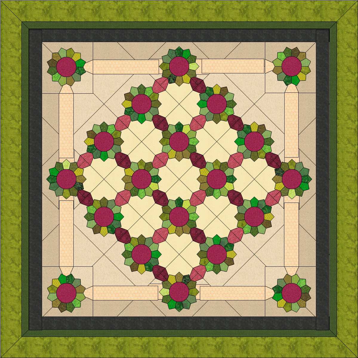
The Dresden plate pattern has been around for ages. It is a classic & traditional design that has been found in quilts for nearly 200 years. There are many variations of this pattern...ones with petals, ones with pointy "blades", ones with small center circles, ones with larger ones, and they can be found with any number of petals or blades too, giving them a much varied look. I am making a simple Dresden plate quilt, intended to showcase large-scale modern-ish prints so I do not want my pieces to be too small. I understand that Accuquilt has a die for cutting a Dresden plate which results in either 20 or 22 petals/blades. I don't have Accuquilt however, so I went to EQ7, where I can design whatever my heart desires. Sadly after I did this, my printer would absolutely not print without buying over $50 in ink cartridges, so I went to the old-fashioned route. This is, afterall, an old-fashioned block, so why not?!

I got a piece or wrapping paper. It's the largest paper I own, and my blocks are 15", which is larger than standard paper. I traced a 12" diameter quilting circle template, and cut it out. I will make my blade template from this. You could make it any size you want. I left a good bit around the Dresden to allow for quilting designs. If you don't have such template, a compass or large dinner plate will work too.
With your circle, fold it in half and then in half again, to mark 4 90-degree quadrants. If you are anal like me, take a protractor and confirm that they are in fact 90 degrees. I hae chosen a bladed Dresden with only 12 blades. Take one of the quadrants and your protractor, and mark 3 30-degree sections. I then square off the rounded end of the section and also shorten the piece where it approaches the center of the circle. We are almost finished. The last thing you need to do is add the 1/4" seam allowance to the sides (and end if you want). Cut this out and trace onto a more substantial piece of cardstock or plastic. Viola, here is your blade pattern.

Sorry, blurry, but you get the idea. Now it is a little tedious from here, but trust me, the sewing part is much faster. Trace and cut out how ever many pieces you need. I do this with 4-5 layers of fabric stacked, using a rotary cutter.

On your sewing machine, fold the piece in half lengthwise, and stitch with 1/4" seam across the end. I do backstitch at the folded end.

Now trim the seam to a scant 1/8". You don't want the bulk within the point.

Turn the piece right side out and press gently with scissors to get it pointy. Press.

Next, choose the arrangement of your 12 blades, and stitch together. I backstitch ~0.5" at the top of the seam so I don't have to worry with loose threads or a seam pulling loose. I then press the seams to one direction (because I will be ditch quilting each blade and this can not be accomplished if pressed open). Then I starch the top. There are many bias edges. The starch helps the plate to hold its shape until it is added to a background fabric.

Missing something?? Yup, the center. This is typically a circle, but since I found this perfect 12-petaled Michael Miller fabric, I couldn't resist. Applique away! I have used a 5-6" center.

I have 5 of my needed 20 plates ready for their background fabric. Please note that after I sew the plates to the background, I highly suggest going back and trimming that "triangle" of excess fabric from each blade point. It has a seam in it and will be very prone to showing through to the top of the Dresden plate when it is quilted. I hate this look :-((

This is my "Walk on the Wild-Side" Dresdens. They are bold and bright, and look so fantastic with the flower centers. Thanks to all for your comments on my quilt layouts. I kind of figured I'd go with this layout all along, but I just needed confirmation that it would be great (rather than going the more traditional route).
Coincidently, this morning I came across another person's blog post about Dresdens. You may find it informational. It is here...


And dont forget about the Quilting Sale...


Have a good Wednesday~

Tuesday, July 26, 2011

Quilting Sale!

To ring in the month of August, I am running a quilting sale! All pantographs and free-handed edge-to-edge patterns are priced at 1.25 cents per square inch. I am also pricing stippling at a penny per square inch! This is cheaper than just about anywhere, and is ideal for your heavily used utility quilts. I have many patterns to select from. They are shown here ... http://www.mainelyquiltsoflove.com/. I stock a great weight Hobbs 80/20 batting in all widths, and a large selection of thread colors. So get out those quilt tops that have been awaiting quilting and get them done! This is also a great opportunity to get your Christmas and holiday presents finished too.

Iwill accept quilts at this price until further notice (sometime in August).

The sale price is for quilting only, and does not include the typical charges for thread and batting (0.22 cents per square inch). It also applies only for pantographs regularly priced less than 1.7 cents per sq in.

Contact me directly if you have any questions at msolomo1@maine.rr.com
For those of you less familiar with my quilting, I am a longarm quilter with several show awards for the high quality of my work. I assure you that the quilt you receive back will more than meet your expectations.

Monday, July 25, 2011

A hot weekend away

As the thermometer read this last Friday (the bottom number is the outside temp at 6:02pm!), we were preparing to getaway to here.
I'd gotten passes from the lirary to go to the Coastal Botanical gardens, which was very pleasant. Oddly my kids do enjoy places like this, and this particular garden has lots of rocks to climb on and water features (sprays, fountains, etc) in which to cool one's fingers (or more!) on a hot day. The hydrandea's were amazing, as were many other varieties of flowers. They have apparently received more rain than we have. My grass and gardens are starving for rain.

Boothbay Harbor is a quaint sea-village with cute shops, boats to take on whale-watching trips, and just a picturesque piece of Maine. The cheapo motel I booked last minute on Friday managed to lose our reservation, and put us up at their cost down the street at a slightly better place. Kids got to swim in the pool, but most of all it was great because it was FREE!


Yesterday, rather than hitting those places that are really just for kids, we decided to do a day trip to Monhegan Island. It's a 90min boat ride on what was a just fantastic day. Monhegan is a year round small community, but has no paved roads and is predominantly occupied by real granola-ish artsy-fartsy types. The ocean-side of the island has treacherously steep cliffs of rock. There are many hiking trails around this 1.5sq mile island. The kids liked a dip in the water at a small beach, and my middle kid thought he'd hit the jackpot for all seaglass finds (there have obviously been many lobster & clam bakes there with a plentiful supply of beer!).

Monhegan is like a step back in time. I think there are a couple trucks on the island. Nowhere takes credit cards, and there is no police or medical services so don't get hurt or sick. It was a lovely and calm day, mostly away from the hustle and bustle of an otherwise touristy area.

Now, back to work!