Saturday, March 30, 2013

Embroidered China/Dishes Quilt


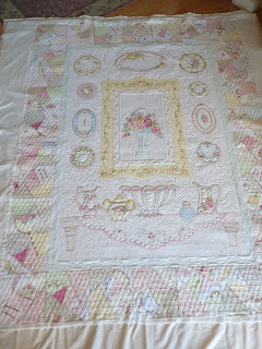
This quilt is from one of my very prolific applique quilters.  I have just finished 4 of her tops, and this is the only one that was not an applique sampler.  It was certainly no easier, but fun because it was different.  This quilt is embroidered mostly on white Fairy Frost.  She has also colored some areas of the embroideries - my guess is colored pencils, but I am only guessing. 
 It is 63"x82"...rather large.  She plans to use it as a decorative quilt, with "light use".  It's unbelievably gorgeous.  Normally, a part of me is like a deer in the headlights when I see massive amounts of plain white background, but this one seemed simple.  It was calling for free-feathers.  And it was definitely calling for the shimmery Glide thread.  Glide and Fairy Frost are a perfect pair.
The center medallion is sweet, but the area needed a little subdividing to create interest.  I created the frame with one of my many, many templates (OK, it was done with Ronda Beyer's large S template).  The border around the center block was stitched with small bows in each corner, and ribbons flowoug outward on the sides.  Simple, feminine and flowy.  This is not a quilt to overthink the details.  Just keep it pretty.
The outer border of the quilt is kind of wide - 8-9".  And it is really the only pieced area too - Broken Dishes pattern, with scattered embroideries.  I could have stitched every crazy-square, but that seemed busy and counter to the purpose of an outer border, whioch I see to be the grounding feature on the quilt.  I chose a stitching that might be seen on something old-fashioned -- a diamond cross-hatching.  It was a bit of a pain to get nice and even, but I am happy with the end look.
 There is a table scene at the bottom of the quilt with a punch bown and tea service.  I love the table cloth.  I made an attempt to make it appear lacey.  Not sure I completely hit the mark, but the table is pretty.

 Here's a look at some of the dishes...You can see the coloring she has added directly to the fabric.
And a platter.  Mostly, my stitching follows the lines of the embroidery, not wanting to interfere with the look she has already created.
Love this one!

 The back shows a lot of detail.  It's a gorgeous quilt, and I am certain that Janice will be pleased.
 (one more...!)
Time for me to get dinner and ponder the next 3 quilts I will conquer this week.  Have a great Bunny day!

Tuesday, March 26, 2013

The Right Thread for the Job

There is one best thread for the job.  NOT TRUE.
 
My machine only runs with "such-n-such" thread.  PROBABLY NOT TRUE.  Or, hopefully not true.  You probably are not comfortable adjusting the tension as you change threads if this is your opinion.
 
I have seen so much verbage to this effect lately on the blogs and facebook.  It forced the interest in my looking back over many of the quilts I have done, both for myself as well as for clients to see what threads I used most freuently, and why each was chosen.  That is probably the more important point.  I don't choose threads for a quilt because I like stitching with a particular kind of thread.  I choose it because it is what the particular quilt would look best with. 
 
There is a nearly endless selection of threads that each quilt can be quilted with.  I will admit right off to not liking to quilt with cotton thread, and more than a year ago I just sold off all my cottons.  It is not that my machine can't run with it; I just don't care for the additional lint or the more frequent thread breaks.  So, with that said, just within the realm of polyester thread, there are a whole host of options.  There is also metallics (also a poly thread) and silk.  So, lets look at some of the quilts and talk about why I chose what I chose.
 
This is Sea Glass.  You have all seen it, I know.  It is batiks and hand-dyes, and the background is pieced in a watercolor style.  Right up front I'll admit that this quilt may have looked great quilted in the shinier threads (Glide, Rainbows, Magnifico - as examples), at the time it was made, I didn't use of know of Glide and Magnifico wasn't around.  I chose, instead, a very fine 100wt Invisifil.  It is so thin that it really only leaves the texture behind, which is exactly how I wanted the quilting to be.  All of the colors and textures of the fabric are visible, and not overshadowed by the thread.  In retrospect, though the sheen of Glide would have been pretty, I do think that the 40wt thickness of this thread would have overpowered the delicate texture I was aiming for.  JMHO.
I also used a blue Rainbows thread on the waves and the inner blue border as well.  It's a 40wt variegated thread, similar to Glide, but for me it is occasionally prone to unpredictable shredding so I use it in small areas and rarely on entire quilts.  It works well here.  Glide would have too, but it's not variegated.


A client made this quilt.  It is stitched all in 50wt So Fine thread.  Her fabrics all have a lot of print.  This quilt was again stitched before I used the shinier threads as often as I do now, but I wanted the fabric patterns not to fight with the quilting patterns.  So Fine is a good thread for that objective.  Additionally, I have many (not hundreds, but an adequate 60-80) color selection of this thread so finding a good shade was easy.   So Fine is heavy enough that it shows, but still fine enough that the pebbling can be stitched and not appear grossly thready. 
This is one of my show quilts.  Again, I like to use batiks.  A multitude of different threads work well with the batiks.  I, however, chose to stitch the feathers in a soft lavender So Fine thread, and the back fills in Invisifil.  The So Fine has enough thickness to subtly show the color nicely.
The darker colored areas of quilts can take heavier threads more easily than the lighter fabrics.  The purple pieced sections have a nice variegated purple Rainbows thread.  It is 40wt and shows just enough.  Fast forward 2 years, a Glide thread would have been good on some areas of this quilt, but I still probably wouldn't use it everywhere.  Just too much shiny.
This is a still-unfinished whole-cloth quilt on silk Radiance.  Today, I would quilt it using silk 100, but 20 months ago I chose the Invisifil, another very fine thread.  It stitched beautifully.  The actual quilting thread is barely noticeable, just as it would be with silk.  It leaves behind beautiful texture.  This is really not the style quilt you'd want to see a 40wt Glide all over.  It would be too thready for sure.  The very fine thread allows the fabric and texture to steal the show.

Zen Garden is one of my favorite quilts to date that I have made.  It has significant texture just in the larger-scale prints that were used in the piecing.   Again, I didn't want the texture from the quilting to interfere with the fabric prints and piecing.  This quilt is stitched with both Invisifil and silk 100 (tan).  It has areas with very dense quilting that this super fine thread can't even begin to alter the fabric's color.  It is just quilting texture.  The print and the piecing/applique were busy enough; I didn't want to see the thread, only it's texture.
Postcards from Venice was my first intentional show quilt.  Admittedly, two years I was not adventurous in my thread choices, nor did I have much selection beyond So Fine.  It is completely appropriate for the quilt though.  I used a metallic thread, which I pretty much loathe stitching with on areas where the fabric has a metallic flecking, but everywhere else, I wanted a flat look without sheen.  This is a quilt of an inlaid mosaic floor.  Shiny didn't seem right.  Was this the right choice?  I guess. 
In my uncertainty, I used a metallic bobbin thread on the back of the quilt though to help hide where I had backtracked over some seams more than I may have wanted.  This got good reviews from all the judges - not that it is required, but that it was an interesting and unexpected element.  It is nice to have surprises.
This is Sue Garman's Stars for a New Day, expect it is in miniature, only about 40" square!  Glide would be spectacular on a full size version of this quilt, but the miniature required a finer thread.  I used both So Fine and Bottomline. 
Patriots and Petticoats...a very much NOT miniature (nearly 100") quilt, in a reproduction style and fabrics.  I think that there needs to be some consciousness to preserving the era of the quilt.  I like the reproduction and CW quilts to be done using patterns that the original (albeit, then hand quilted) may have been done in.  Additionally, I like the thread to look like a hand quilting thread.  Since I don't like/use cotton, I choose a polyester thread that resembles cotton - Superior's Omni.  This thread stitches beautifully for a 40wt thread.  It's flat, non-shiny and tensions nicely.  I don't do super dense fillers with it, but when the style desired is similar to this, Omni is great.
This is a recently done client quilt, or a very small shot of the entire quilt.  The majority of the quilt is white Fairy Frost, with color-enhanced hand-embroidery.  It is lovely, delicate, shimmery and oh-so feminine.  This quilt, more so than many others I have quilted recently was screaming for Glide thread.  The shine on top of what is a mostly solid, blank canvas is perfect.  If you are confused, I will post this quilt in a post later this week.  Unfortunately, it is hard to convey "sheen" in a photograph.
This is a mere section of a wall-hanging I did this winter.  Much of the thread blends, but the large, sweeping curves and cross-hatching and feathers is stitched with a silver metallic thread.  As I mentioned early on in this discussion, I am not a huge fan of metallics.  They shred and can just be tempermental to deal with.  On top of that, they aren't super soft to the touch so I wouldn't want it on a quilt that I handled or slept on.  But this metallic by Wonderfil is quite soft, and stitches pretty well.  And in moderation, it gives a great effect.  As an alternative to dealing with the headaches of metallics, the Glide thread in the same color can have a similar effect.  A little goes a long way with metallics.
I do love Glide, as many of you all do too.  I have used a gold Glide on a couple of recent show quilts, including the one below.  This quilt is made with the Stonehenge fabrics, and several have gold flecking.  I think the shiny gold thread looks nice on them, showing up just the right amount.  I particularly like the use of a slightly more showy threads in this case because the fabrics read as mostly solid or mottled.  On true prints, however, Glide is not always my preference.
I guess it's about time to wrap up this thread discussion.  This is a recent quilt of mine, Big Bertha.  I will be at MQX in 2 weeks.  I stitched this with silk 100 in 4 different colors, each matching the fabric.  It's monochromatic so that the texture shows, not the thread color.  I chose the finer silk thread over a So Fine or Glide because I stitched several areas quite densely, I don't care for the look of thread build up.  Silk thread is pricey -- probably $40 on this quilt on the top only (not counting the bobbins), but it runs so smoothly, not having the shredding that poly can have.
What is the whole point of this?  Are you wondering?...My point is that there are a plethora of threads available for us to quilt with -- way more than I have even used or probably even know about.   I have stitched with many, and though I may have ones I like better than others, I know that one thread definitely does not fit all quilts.   I can't reasonably use silk on all my client quilts just because I love how it runs.  It is expensive.  But I do make exceptions on my own work.  Different quilts call for different textures, thicknesses and sheens.  Your choices may not be the same as mine, but perhaps some of my rationales explained here will give you some guidance when your next quilt asks "what thread to I use?"  Don't be afraid to experiment or to learn to use different threads.  It is OK to mix different threads on a single quilt.   Variety is the spice of life :-)

Monday, March 25, 2013

Getting it Done

 
Here's a quilt for a baby boy that was finished up a week or so ago.  I have 4 of this client's quilts, and am currently working on finishing up #3.  They should be all set to go by week's end or early next week.  She does a lot of hand applique, and the work is really nice.
 This is a cute quilt that I have not seen before.  The blocks are very boyish - more so than I ever used on my kids's quilts.  The quilting uses mostly So Fine threads - I didn't want anything shiny for this quilt so Glide was out.  I have not used SoFine in a while and have forgotten how well it can run in the machine.

 The blocks have a couple of different fillers to make the appliques pop.  The pin-striped ones wee used because they seemed to tie in well with the baseball uniform's ticking fabric.  It's simple, non-frilly, non-girly, etc.  Although I have been known to use feathers on a quilt for a male, this one just seemed "ALL BOY".
I love how the rolled up shorts use the backside of the fabric for the part rolled up.  The details on this quilt keep you looking.

I'm busy trying to push through my backlog of quilts because April is just going to be a nutsy month.  I'm getting pretty excited about going to MQX in 2 weeks, and then Paducah 2 weeks later.  It doesn't leave that much time to just get things done though :-)

Tuesday, March 19, 2013

A Secret Revealed...

Last month, I was asked again by Handi Quilter to be a part of their advertising campaign.  Quite surprised at the offer, I jumped at the opportunity.  I did this in 2011 also, but this time's photos were much different.  Much better if you asked me.   A professional photographer came to my house.  Using 10 or so of my quilts, about 5 wardrobe changes and 3 hours of smile-time, several hundred photos were taken.  I haven't seen the other 299 (my wild guess there!) photos, but this is the one Handi Quilter chose.   Here's the end result which you will see gracing the pages of upcoming quilting magazines.
Handi Quilter makes really well functioning quilting machines.  I have had mine about 3-1/2 years now, and couldn't begin to tell you how many quilts I have quilted.  I did, however, check the stitch counter yesterday for giggles, and it reads 30 million stitches to date!  That's amazing.  The quilt in the background ("Primavera") is one of only two that are in my house that were small enough for the photographer's photo stand.  It's one of the first I longarm quilted for myself back in 2010.  The essence of this 2013 ad campaign is "Finishing Quilts".  They are supposed to be homey and to appeal to real everyday quilters, and the things that quilting means to them.  There have been other ads that say "...Maintains Traditions" and "...Warms my Family".  Angela Walters did the latter one; I'm sure you've seen it with her adorable kids.  I'm pretty thankful she got that shoot...taking this with my three would have made me crazy!  So, be on the lookout.  This is what I look like when I'm not busy quilting in my jammies :-)

Sunday, March 17, 2013

Asian Pots Quilt

This is one of my favorite quilts that I have quilted in a long time.  It belongs to one of my clients.   A couple weeks ago I did her floral applique quilt, and now this quilt, also appliqued.  This one is wonderfully stitched, and looks like she has really mastered the technique!
The magnificent detail of these fabrics is most certainly lost in the photographs.  They are heavy, beautiful quality, and many have gold flecking.  It's the kind of fabric that just screams "touch me".  She's done a great job of fussy cutting to show the details of the fabrics on the pots.  
Because the pots and the fabrics are the feature here, I chose a background quilting for the gold fabrics that is monochromatic (gold Glide thread), yet with exceptional texture of the free floated feathers.  These feathers are so much fun to quilt, and always look amazing.
The quilt is huge sashings.  If you figured the area of the sashings, I think it is close to 25% of the entire quilt!  With that in mind, I knew that they needed to carry the design.  My client has called this quilt "Dutch Pots", but the fabrics and style of pots just screamed Asian Pots to me.  I have been to the orient as well as to Holland, and although the colors may be Dutch, the style and fabrics are all Asian.  I went with this, and designed the sashings accordingly.
 Whoops...a little geenie pot here (crooked at that!). This is one of my favorites.
 I used the features of the fabric to dictate where I stitched on each of the pots.
This shows how the sashings can become a very integral part of a quilt.  They make the blocks look like they are outlined in circles.
The cornerstones are machine embroidered.  I'm only guessing that she did these too.  They just look so perfect on this quilt, matching impeccably, and really completing the Asian look.  I just gently stippled around them to make the circle pop out a little.
This quilt has significant ditch quilting with Madiera monolon clear thread.  All the pots, details on the pots, sashings and outer borders are ditch quilted to hold the shape.  There's really no point of custom quilting anything if you don't secure the edges with ditch quilting.  The other thread I used is the gold Glide, an ivory Glide on the outer border, and a royal blue Glide on the sashings.  The sheen of this thread works well with the metallic flecked fabrics.  The quilt has Hobbs wool batting.
It's really lovely, and was a fun quilt to stitch.  I an now onto a stack of 4 more applique quilts, with a hope of completing these before I take off to MQX in early April.

Thursday, March 14, 2013

Winning, Sewing and Planning

Though I have another of Erin's great applique quilts to show, I'll do that tomorrow or on the weekend.  They are both ready to send back, and it's time for me to dig into the boxes of another prolific applique client of mine.  I think she sent four!  First, though, I will leave you with my week's bit of awesome news.  I sent two quilts to the AQS Lancaster show, which is on right now.  One of them is bringing home a wonderful 1st place ribbon!  It was such a complete shock to get the call.  I still think of this quilt as the Problem Child because of the bleeding issues I had 9 months ago as I was trying to finish it up.Vicki Welch is at the show and was nice enough to send me this truly awesome picture.  She, incidently, it the reason that the quilt has no visible dye on it now.  She was a tremendous help suggesting what to do when it initially bled.  Since the 1st place prize is that good (if you get my drift), I have decided to take half of it to fund my trip to Paducah next month!  I'm so excited...two quilt shows in one month.  First MQX, then 2 weeks later Paducah.
 The last 2 days I have been doing a bit of mind-clearing, sanity building piecing.  I'm gearing up for the next wind of intense quilts I will do, but sometimes if I allow myself some time to make progress on my own projects, the quilting is more enjoyable.  I nearly have this ready to put the "big pieces" together.  Unfortunately, I made a big mistake trimming the corners of the green.  Now I get to wait a few days for another piece to arrive.  The mosaic sections are all done, and if I do say so, took FOREVER.  It is about 750 - 1/2" squares!  I'll show another picture in a couple days - it looks much different with the gold finished out!


Sunday, March 10, 2013

Back on the design horse

I am desperate to finish one of my tops that has been in rather large pieces for weeks/months now.  In all honesty, I have 3 quilts in this state, and have a horrible itch to start another.  I refuse to start one, however, until I get 2 of them into completed flimsies.  I have shown this before I think.  For a while now, it has been the prevailing plan/design.  Note that all 4 outer mosaic borders will be like the upper left .
 So yesterday I started stitching the striped corner sections to the peachy center square.  They are being a little persnickitty but I think I can make them work OK.  I have thought all along that the addition of the of the brown square on point (it's not really a square) had made the design palatable to my taste.  It does help to define a bold shape, equal in intensity to the peach square.   My mistake came when I decided to rotate the center section that I had pieced to date...
It went from this (above) to this (below)...
I happen to like aspects of the rotated design...I like the peach focal on point.  I like the original design when it comes to the center - my eyes likes the gold center square on point, but get confused when I see the big peach square.  The trick is redesigning the remainder of the quilt to use the outer florette corners that I already have made, and NOT making the overall footprint of the quilt much larger than the original 68" I had designed.  Too many design criteria~!  I have puttered with how I'd make the rotated version work with regards to the remaining borders. Fortunately I have plenty of the gold fabrics.  And remember that the above concept will still have the black outer border with the mosaic shown in the top picture (EQ7 rendition).  I may even add in the brown faux square (only showed the triangle at the top border).

Does anyone have thoughts?  I hope to work on this later this week and next weekend but hate to feel conflicted and uncertain which design has the most punch.  When you look at each layout, what do you see? What do you want to see?  ...the center square or the peachy square?  Does your eye prefer it square or on point?

...or am I just neurotic :-)

Saturday, March 09, 2013

Floral Applique

Erin says that this was her first applique project.  It is 20 LARGE blocks, all turned-edge applique, in the most beautiful fabrics/colors.  She's sent me a number of quilts in recent months, but I have secretly been waiting to quilt this one.  I love it.
This quilt is 90"x108", so it's not a small quilt whatsoever. It took me quite a while to do -- something like 7-8 hours just to outline all the appliques with Madiera Monolon (clear thread).  It's time-consuming, and many quilters skip this step, but I know that it yields a better looking product.  All of the piecings of the quilt are much more crisp.  I won't do a custom with only half of the stitching that the custom requires.
The border is a lovely floral.  It is one of those fabrics, though, that it is hard to quilt and have the stitching show effectively.  I sometimes do piano keys (aka straight lines), but decided upon feathers for this quilt.  The stitching in the shiny gold Glide thread shows just enough even in the floral.

I cannot remember where she told me the pattern came from (who designed), but it is not one I have seen before.  To keep the quilting consistent from block to block, I chose to only stitch on some of the applique elements.  I did a ring of feathers on the pale yellow circle - on all pale yellow circles, all lighter green leaves, and then echo quilting in the lightest green.  The echo quilting is stitched with Invisifil thread.  I haven't quilted with this recently, but it is 100wt and super fine, and just disappears into the quilt.
The quilt has Tuscany wool batting, so the appliques have a nice and gently poof.  It will not compress with time like cotton will.  Most appliques have enough stitching just in the ditching, and didn't really need any on them.  It would only have mashed them down.
 The soft yellow backgrounds are all stitched with feathers.  It makes for a nice delicate-looking quilt.
 I can't show all 20 of the blocks up close, but I have chosen a few of my favorites.

 It's an interesting pattern, combining both regular cottons and batiks..
 This is probably my favorite block, if there is a favorite.
 The quilting in the red squares is only intended to give the viewer a different shape to see.  I need to combine straight-line work with the feathers for a nice variety.  This is going on a bed, and not to a show, so over-quilting would only be a mistake.  It has just the right amount to show the quilting, and capitalize on the beauty of the wool and the applique work.
I sure hope Erin likes this :-)