It always feels like it has been a lifetime from the start to finish of a show quilt. I am not one of those that whips them out every 6 months. They seem to take a lifetime closer to 18 months. This quilt is no exception, taking about 20 months.
It is April 1st as I write this post. It will go live after the MQX judging of this quilt in another 10 days. I posted a few photos earlier on in its construction, but got frustrated when other folks immediately reposted them to pinterest, despite my requests for them not to. I found that rude, and decided that readers would just have to wait until it makes its show debut to learn about the story of its making. Sadly, show quilts that are in the works will also not be shared. Social media is a blessing and a curse sometimes. What does this mean? ... See the copyright statement to the right?...Please do not post these to pinterest just because you are able. If I want them there, I will do it. Thanks.

So, this is My Secret Garden. It is inspired by my some of my favorite flowers, photos from my personal garden. As with all my quilts, it is original, designed by me. I have had this infatuation with orange for several quilts now. I still remember a woman who I talked with in front of my quilt Bouquet Royale in Houston in 2015 who commented that she liked orange. She never thought about using it in a quilt because it is different, but after seeing my quilt there, decided it was a great color choice for a quilt. I had grappled with those same thoughts at the start of that quilt, and quickly decided I loved the feeling of seeing orange with some of it's complementary colors -- green, punk, purple. The Twisted Sister had orange in it, and so does this one.


August 2016...My kids were not in school yet. I wanted to do some easy piecing. At this point, I had absolutely no clue where this project was heading. I made 36 log cabin blocks from my assortment of pink and orange cottons, and my scraps of 3 or 4 colors of neutral silk Radiance. Clearly my love affair with silk is still alive, along with the look of combining the silk and commercial cottons.
There are many ways to arrange 36 blocks, but I was settling on this one, with 5 distinct places to "add" to. What was being "added" would remain to be seen.
In September of 2016, I drafted some applique. It is not uncommon for me to lay in bed and doodle. I'm surprised that this sketch still exists after these many months (obviously house cleaning and purging are low on the list of priorities!!). It was the beginning of this arabesque shape that I used in several ways on this quilt. ok, just noticed I put "copyright 2015"...wrong year, but whatever.
This general idea ...transformed into fabric.
I don't often design overly realistic applique (an the artists out there might argue that this is not realistic either), but I was aiming for appliqued flowers that were clearly recognizable, rather than just generic "flowers". I had designed this
lily for a swap quilt I made many years ago.
Designs for a tulip, merigold and cone flower also evolved. there were many others I could have added like poppies and begonias, but I needed to use ones this non-artist could create! Stitch...I can do, but my drawing skills have their limitations.
After designing and stitching the applique on the log blocks, I set out to design the 6' side borders. They are 10" wide, and I wanted them to be full with applique, like my overgrown garden is...LOL!
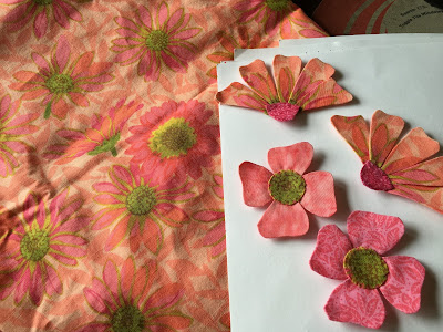
On the borders, I added some other flowers. The dogwood blooms are a personal favorite and a subtle homage to my love of the South. I love this piece of Martha Negley fabric that I have hoarded for years, and the green centers were perfect for the dogwoods. I also made these peachy petal flowers from fussy cut pieces of the flower petals.
It's a little-known secret that I always incorporate fabrics from past show quilts into ones that I am constructing. It is my way of giving a little good luck to the next ones being made. This fabric was in some of the hand-pieced hexagons of Bouquet Royale. Many of the green fabrics were used here and there on other quilts too. One can never have enough great green fabric scraps!!
I always like to emphasize the center of the quilt. This wreath of leaves was added for that purpose. Slowly but surely, I hope to convert a quilt of log cabin blocks to one of applique.
My studio became an applique flower factory. Each flower was made from several units, each of which had edges starch-templar prepared under for hand stitching. I assembled each individually, then they were appliqued onto the respective border pieces.
Here, it looks like most of the flowers and leaves are prepped. Just the vines and branches to do.
It is not uncommon to have "left-overs" when a quilt is finished. I had a few leaves and pieces not used, as well as these piped scallops. I think I envisioned using them to create a scalloped border, but when it came time to do it, it just did not look right. I will keep them in case a future project beckons the need. That may be the definition of a hoarder, but who wants to make these twice??

The serpentine floral applique is hand stitched onto champagne colored silk Radiance. I have discovered that the bias vines often cause fabric (especially silks) to pull in a bit. By virtue of how this stuff is pulled through the bias-maker, it tends to stretch. The way I deal with this is to block the units on a piece of foam board before they are attached to the center of the quilt. Each border is gently stretched to it's intended size, and pinned into place, both along the edges as well as along the vine. I then spray it until it is soaked, and allow it to dry a day. This sets the size of the vine so it does not pull up again. Before I ever cut the applique, all fabrics were soaked so that they would not bleed, so when it comes to this point, I have no fear of bleeding pinks and oranges!

The 4 border units have all of their applique, except that which goes along the miter areas where adjacent borders meet. Here, I have pinned these flowers/vines into their position, and set the 45 degree corner seams, which are hand stitched. While the floral applique all appears cohesive, it is obvious that all 4 borders are different. I like this.
Now, I had one more thing to add to the borders - some butterflies! I have this awesome ivory fabric with a dozen or more perfectly-sized butterflies. I fussy-cut several to include on the border, and positioned them around it. I needle-turn applique them, and add embroidered bodies. The antennae would be added with the quilting.
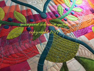
The other thing I added was a turquoise inner border. It is a fairy frost fabric, and for some stupid reason. I put a teal piping between it and the log cabin blocks. Why I get these whims to add pipings eludes me. I needed something, that little pop of color, to bring accent to the tiny berry clusters. Blue! Just a little bit of the blue!
Pop colors, in this case the turquoise and lime green, play an important role in the overall look of a quilt. They help the viewer's eye to move and to catch the smaller, more subtle details.
April 2017...Eight months after starting the blocks, I was starting to design the quilting. I had thought about this during the construction, but now it was time to start truly auditioning the potential design(s) and get this quilt marked. This would be my first show quilt to be quilted on my new Fusion.
I knew I wanted to bring the arabesque shape from the central applique frames into the actual quilting. It is different in shape, but I think it is a transferable similar shape. It was a crazy quilting plan for the outer border, working around the many applique bits. People have become accustomed to me doing crazy. Lord knows I know crazy with an intimacy.
I wanted other areas of the silk background to appear to be wrought iron, as though you are looking through a wrought iron gate into this lush garden.
The actual design for the center applique blocks began as above, but morphed into something different. That is normal too. I wasn't sure how the clam shells would look broken up.
To do the wrought iron, I made a plastic stencil, and traced it a kazillion times. I probably could have done it with a light table too, but didn't.
May 2017...Quilting commences. I began by outline stitching all the applique. FYI...it is double batted with Hobbs 80/20 (wool/cotton) and Hobbs Tuscany battings. I am ditching with Madiera Monolon.
I brought a bit of the wrought iron design to the outer border too.
Here is the center section before the back-filling was added. I didn't have a plan for the log sections so they are just basted to keep the lines straight. Many sections were left until the desired design made itself known.
I loved the center of the quilt from the beginning. I think it is a great central focus, both in design as well as in quilting. I marked triple-stitched rays, and quilted them in a Superior Fantastico variegated blue thread. I chose blue so it showed on the orange and pink fabrics. And blue, because blue is in the applique.
It left an absolute ton of stop and starts to be buried!
...and this was so totally worth it though. Love the rays!
Some of you may remember that my machine and I had a major temper tantrum over quilting fine threads. The Fusion was finally sent back to Utah where folks at the factory tweaked it to where it needed to be to quilt silk thread. Before this happened, though, I got impatient and quilted within the outer border with a peachy 40wt thread. I knew I should have waited, so that it would be more subtle, but I really wanted to get going with this. Live and learn. The machine came back, and with a few new learnings, I was able to quilt with 100 wt thread again. Dense stitching around the wrought iron, and that on the center of the quilt would be done with silk or Invisifil.
Next came the time to figure out what to do on the corners and colored logs...I decided on a floral/feather motif, with matchstick quilting in a blue thread. Again, I want this to show, however subtly.
I also added a scalloped finish on the red inner border. It's more of a tomato red-orange color.
Here's a look at the gorgeous floral I found for the backside. I love these big blooms! The back does not have the same punch as when a solid fabric is used because the quilting would show that much better, but it is pretty.
Maybe it is for the best...since I had a day when this kind of tension appeared! I did remove this, as it is atrocious, but this type of print certainly hides small tension anomalies that a solid will not.
The quilt came off the longarm for the final time in the mid-fall of 2017. I immediately trimmed the excess fabric from around the edge to keep me from reloading it and further obsessing. It was blocked and prepped for the binding.
There is a pink piping and a scalloped edge binding. I would have loved to do something more unique, but really, the binding is not the focal point of this quilt. It just needed to be clean and appropriate.
I did add fuscia satin embroidery hand couched around the edge of the binding on the backside. It is not necessary to embellish the back, but I do it sometimes because it creates a nice finish. With all the months invested here, what is another 15 hours of embroidery??!
I also added some beading to the front. The lilies got dark brown beaded stamen.
These flowers also got some brown beads. I'm not sure if this is entirely realistic, but it gives them a small bit of texturing.
I also added a beaded detail on these flowers, just a little bit.
It is easier to see here. That is what is great about finishing details. They rarely overwhelm the look of a quilt, yet they help to draw you in to see the details up close. Perhaps you can also see where satin embroidery floss is couched around the teal arabesque bias frames. This took about 3 hours per frame. All in all, the finishing details after the binding was done took nearly 80 hours. Yes, after the binding.
I beaded the centers of the dogwood booms, and then almost undid it out of uncertainty. If it gets any adverse comments after its first show, they can easily be removed.
Tiny (and I do mean tiny) turquoise crystals were added at the base of each berry on these clusters, as well as on the berries at the central wreath. I have become fairly discerning about using crystals, not wanting my very traditional quilt to look like a Vegas show girl. I don't love the overuse of crystals on many quilts. A little goes a long way. Just enough sparkle to catch the eye.
Just because I hadn't wasted enough time, I decided to go for a creative label. It is all done with machine applique. I just didn't have it in me to hand applique these leaves (which were in my "left-overs" bag, otherwise they'd never be there!). I think it gives the backside of the quilt a little classy finish.
OK, last photos...
I don't have expectations that this will place at MQX this week. There are just way too many very good quilts in the show. I am happy with what I have made, mostly, and know that it represents my color and design aesthetic well. Making something that is not "me" is just not going to happen. I am anxious to see it and my other quilts hanging at the show. BTW, my 20-quilt exhibit of retrospective quilts will be at the Manchester show. They were at the MQX Midwest show also, but this time I have most of my 2015-2017 show quilts available too.


