Thursday, January 29, 2015

Feathered Stars

Smack in the middle of winter...not a whole lot of cooperation with the weather,  The day that I tried to take a picture of this entire quilt there was very flat light.  But you get the idea...it's 78" of pretty feathered star blocks.  And it was destined for a custom job.
This quilt has a wool batting, and Glide thread on much of it.  On the colored areas I tried out a Fantastico sample that must have come in a MQX bag last year.  I dont think I have ever bought it. Its a 40wt variegated in shades of green, brown.  It's kind of non-descript, but contained many of the colors on the HST border.  The borders are wide, and I opted for some swirling feathers.  These are pretty but take a while to make out and stitch.
Pretty corner...
The feathered star blocks have no shortage of curved cross-hatching, stitched with my 20" boomerang.  It gives a nice texture to the background.  I SID nearly every seam on the quilt, unless it was pressed open.   To give the feathered star some detailing, I pulled out one of my simple stencils.
 Now, most of us can stitch a feathered wreath in our sleep.  I chose the stencil because I wanted all 9 to look identical AND because I was stitching with a contrasting thread, so the nonuniformities would be that much more visible.  Stencils are a simple fun way to incorporate part of a design into your quilt.  Lastly, I added an echoed leaf shape into the larger triangles.
 The feathered stars are pretty.  The fact that they are pretty and visually interesting helps to draw the eye away from the 8-pt stars along the sashings.  This was an area I struggled with.  The quilt owner had difficulty with the piecing of the square-in-square, and I didn't know what to do when many of the points were chopped off.  I wondered if I ditched the square if they'd look worse.  All I knew is that they didn't look good before I quilted the tight swirls.  As it turns out, the swirls help to recede them to the background, and the pretty feathered stars draw your eye away from them -- a winning combination.  Not everybody is perfect in their piecing.  More importantly, everyone's standards on what piecing is acceptable are different.  It's my job to figure out how to quilt for each quilt, bringing out the best features.
I am now up to my proverbial eye-balls in snow...two snow days this week (30" fell!) already and a potential 3rd one tomorrow, to give another 8-12".  I cannot imagine where we will put it.  I am plugging ahead on a very detailed custom of the Ladies of the Seas quilt, hoping it will be done this weekend.  It's gorgeous!


Saturday, January 24, 2015

Road to California 2015

The Road to California quilt show is in its last day now.  It is typically a show of high quality quilts from around the world.  I entered last year and to my surprise took a huge award.  This year I entered 3 quilts, not really sure how things would turn out.  This Tuesday I got word that not only did all three ribbon, but two of them took 1sts!  In past years, if you didnt get a "top" ribbon, the money was pitifully low for this caliber show.  This year they changed the winning amounts.  A first place was a nice $1000!  

These three are the ribbon winners for the traditional wall pieced category.  I actually had 2 in the category -- something most shows don't allow.  I figured that getting both to ribbon was a real longshot, but there's the surprise!  Autumn's Surrender took the 1st and Kaleidoscopic Calamity took 3rd.  The biggest surprise for me though was that my quilt beat the one on the left, "October Sky", made by Bethanne Nemesh.  She's a friend of mine, and this is one amazing quilt.  Her's and my Autumn Surrender have both won Best Machine Quilting at subsequent MQX shows.
Her style of art quilting is totally different from what I do -- I am no literal artist!  The quilting on her quilt is incredible,
It is loaded with animals and scenes of fall. Her's is silk also.  Wish I was a fly on the wall of the judging room when these were judged! 
My other quilt from 2014 (Springtime in the Geisha's Garden) also placed 1st in the wall traditional applique category.  I have to wait until I see a show book though to know who else had quilts in that group.


Tuesday, January 20, 2015

AQS Albuquerque

Thanks to my many friends out there in blogland and facebook-land, I have received a few pics of my quilt that was at the AQS show last week.  This is "From the Bride's Trousseau"'s first show, and I am delighted to see it sporting a big blue ribbon.  One of my facebook friends has a particularly keen ability with a camera.  She posted great close-up pics of many of the quilts, and the next 3 were her's.
There's no having bad stitches when you are being examined this closely!  I am happy to see that the colored thread does show.  I need, however, to check the blocking when it gets back home, as it hangs with definite folds.  Being in a box since early December doesnt help that.
 
 This is my favorite clamshell fill...
 Enjoy!

Sunday, January 18, 2015

Hindsight

Hindsight...  The ability to have knowledge of an event only after it has occurred.   

The path many of us take in our quilting is often a journey in hindsight.   Why does it take doing something one way only to realize it should have been done another.  At least in this case the redo does not involve picking out stitches.  Putting more stitches in is much faster!!
So almost immediately after posting the original quilt pics on Friday, my client agreed that the quilt looked like it needed more quilting.  I knew in my mind it needed more also.  I so often am caught between that desire to put more to the quilt design and wanting to watch that cost.  I had already put a high number of hours into the quilting, making the PSI on this 52" quilt twice what most might think a quilt this size ought to be charged.  I am not an inefficient quilter either.  I had not had thread issues which can slow the process, or any picking out.  It just, plain and simple, has a ton of detail, lots of stitch in the ditch and LOTS of stop and start on those gold circles.  I will take the resulting PSI as learnings to the next highly detailed quilt I am asked to quote.
So, what was added??...The purple stars were densely quilted with a purple Glide thread.  It is a tight stipple, nothing fancy.  The sole purpose was to push the purple to the background, so that the petal arcs can be brought to the forefront more.  Quilting is constantly a game of using one mode of stitching to create visible relief to another.  Ying and yang sort of.
The other thing I proposed to Carol was possibly adding a petal-like stitching to the outer edge of the gold circles.  She bit on that option as well.   I like this stitching because it brings a different look to these circles.  They are no longer dinner plates, but now more flower-like.  There are plenty of long sweeping curves on this quilt.  It needed something smaller-scale and ruffly.
 My cloudy Maine day makes it rather challenging to get great photos of the "after" quilt, but it is much more textural and lays much flatter.  It will make a better show quilt.  I discussed with Carol one last design detail -- the addition of 1/2" circles at the centers of the petals.  There are small imperfections in the piecing (in all honesty, her hand piecing of these quilts is so spectacular, and clean), as all of us would be prone to.  She discounted this option earlier on in the process, thinking it would be viewed as a coverup.  I convinced her that I truly thought it was a great design decision, bringing a different look to the quilt.  Yes, it does hide a few things, and who is not into that?!  But she's already taken a modern twist on a very old-fashioned pattern, so there is no sacrilege in taking that vision a little further.  Just to model the notion...Yesterday, I snapped the next picture.  It was before I did the scallop ruffles on the circles, but I wanted to show the look of the dots.
Since removing the quilt from the frame, however, I believe my initial thought of red dots and red binding really ought to be a deep orange (like Hoffman 1895 Singapore#240).   A deep purple would also be nice, but I like the idea of pulling another complimentary color into the quilt.
All's well that ends well.  I over think and rethink my own personal quilts all the time.  Occasionally, it happens on your's as well!  This is all part of the design process.  It is how better designs and more creativity are borne.

Friday, January 16, 2015

Old Traditional Pattern with Bold Modern Prints

This quilt belongs to Carol.  She's a great prolific hand piecer from Panama.  I have quilted several tops for her in the last 2 years.  Here's yet another.  In fact, she's the one that created my curiosity about the elongated hexagons to the point where I had to make one.  I've learned my lesson and don't plan to make this one!@!   BTW, my hexies quilt is nearing done...the finish quilting has been done and I am adding some hand embroidery.  Mostly all that is left after that is a massive scalloped binding.  Digressing...
This quilt will go to a show this coming fall, along with a few others we have done.  This is a 52" quilt, all hand pieced.  She uses Inklingo to print the pieces for stitching.  That is why everything aligns so perfectly.
And she does love the bold large-scale prints!  I used a single layer of Hobbs Heirloom wool batting. Sometimes I do double batt show quilts, but I felt that there was enough risk with the amount of thicknesses at the petal intersections, that I opted to omit the layer of cotton.  There is just nothing worse than getting the needle-sense-failure everytime the needle cannot handle the thickness.  The wool batting will show off the loft nicely alone.  Many, many show quilts are done with only a single layer of wool.
Every, but every seam was ditched with clear nylon.  That 8" circle sure got a workout -- like 5-6 hours of workout or more.  Then, the details on the circles and petals were added.  I used 2 different Aurifil polyester 40wt variegated threads...one has shades of gold and orange, while the other is pinks and purples.  They show a little here and there, and blend well most other places.
It is always such a quandry what to stitch on such busy quilts.  You want the designs to show over the prints, but I don't want to overly complicate the design of the quilt.  I love creating secondary patterns, but in the end just decided that trying to create secondary designs might make myself batty. The pieces on this quilt really are not all that large either.
As I look at this (and of course it is already invoiced...DOH!), I am wondering if I should have densely stitched those purple stars.  You know...mash them down to the background completely.  I hesitate to do this on other people's quilts (there is that stitched past the point of no return - a risk I take on my own work, but infrequently on others), but it might really make the circles and petals pop more.   Thoughs on this issue??...Oh, the dilemmas...Hate the thought of altering a final cost.  Will have to ponder this some. There are 36 locations to stitch at, plus the reload time.  Sigh.  Buggers, the design artist in me thinks it ought to be done.
 It needs a good blocking to make it lay flat.  Intersections like the one below are so prone to "dimpling".  I see this routinely on some of the mariner's compass blocks where 8-12 seams come together in a point.
I had the pleasure of having a nice E2E to quilt this week also.  I get so many custom quilting requests, so I really do cherish the few simpler jobs that come my way.  My webpage header should read "I'm not just a custom quilter"!  Ha!  Time for the weekend~

Monday, January 12, 2015

2015 Holiday Quilts

As soon as everybody trucked back to school a week ago, I went straight to work on my backlog of quilts.  First up were two of Jan's quilts - a Halloween and a July 4th  quilt!  Now I didn't even get these until mid October so having this done before Halloween was out of the question.  

It's not the greatest picture, but this is a quilt like I have never seen!  It's wild and fun and full of appliqued ghouls.
 Mostly, it has subtle suggestions to Halloween, like the spider web in the corner.  I quilted the background of each purple block differnetly.  I used the person in the frame as my inspiration for a pattern.
 ...Like Mr. Pumpkin head...he just needed a few pumpkins worked in.
 There is one rogue neon green spider.  It is Halloween afterall.  Any more than that would just be creepy!
 This googly-eyed guy got googly-eyes for his background!  Seemed appropriate.
 Bandage man is one of my favorites
 This quilt has Hobbs 80/20 batting and either Glide thread (purple and green) or Omni (black.  It was a fun quilt to quilt - nice to do something that just takes my mind off of Christmas.  If I am seeing Halloween, then Christmas is officially over!
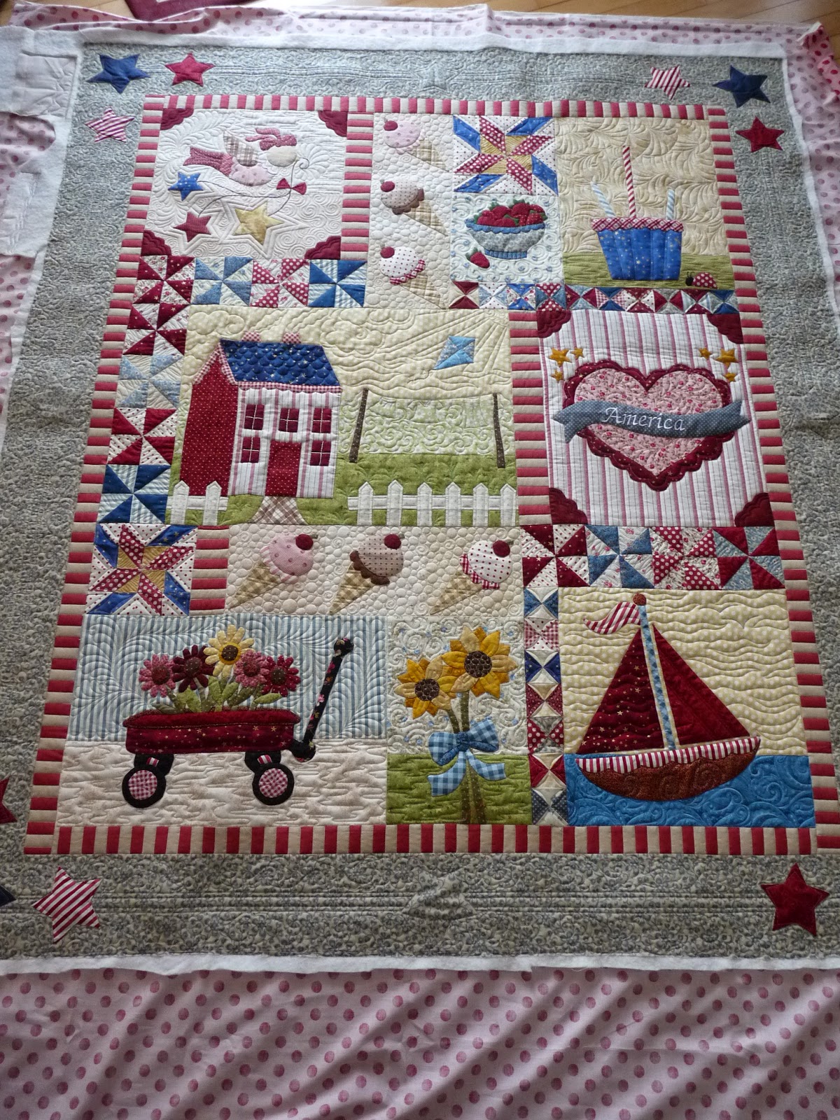
The 4th of July quilt is super cute, and not the "scream in your face" type of holiday quilt.  There's no flags and uncle Sam's, thankfully.  It is lovely, with lots of piecing and applique.  Just enough stars and patriotic colors to make the statement.
 Who doesn't love ice cream?...I used several colors of a polished-poly thread by YLI...there's a neutral tan, and blue and red and green too.
 Samplers either drive you batty because they are hard to create cohesion, or you love them, because there is always something different to quilt.  This one was fun.  I knew the ocean needed waves, but the fabric had just the right lines.  I just followed the print with my stitching.
 This scene is too cute.   The laundry line and some clothes were added.
 here's another look...
 Some feathers, some not overly dense fillers.  This quilt has an abundance of details, but it doesn't have to be stitched too densely since it will be used.  Hopefully Mr. Bird will be getting an eye when it goes home.
 The borders were done a little different.  I stuck a star in the center and gave them straight lines with fills.
 This scene will get some 3D pinwheels added.
I am finishing up a couple more class sample quilts and THAT will be done Yea!  On to a nice soothing E2E tomorrow though.  Then the list of higher end customs which is not getting shorter does call.

Saturday, January 03, 2015

From the Bride's Trousseau

My memory is pretty fuzzy in that I cannot remember if I have posted pictures of this quilt now that it is finished.  I think I may have just shown some in-progress pictures many months ago.  It is official, my ivory silk wholecloth is finished, and is currently awaiting judging at AQS Albuquerque in another week.  It has some pearl and emerald crystals added that are most likely not in the photos too -- hence the name I gave it.  It just reminded me of something a bride would have.  Perhaps I have just made too many quilts to come up with an objective name!
The sketches for this quilt started years ago.  In fact, looking back to the summer of 2011, I made a silk wholecloth which I never finished from a "decendent" of this design.  It has been tweaked significantly since then, and my skills have clearly changed as well, allowing some more complicated changes.  My poor brain isn't content without some complexity, though, and that is why I envisioned color from the beginning.  How I planned to get color was through the thread.  Little did I realize how challenging this would be with the silk 100 thread!  Live-n-learn.

It finished at about 52" square.  Yes, there is a seam down the center of the silk Radiance.  For the most part, it doesn't show unless it is wet. The next picture may even be of the back -- which is also off white, but it is a sateen.  All the thread shows, even if it is not right!  No prints to hide anything. That's probably the name I should have taken "Nowhere to Hide" <>
My brain thinks very much symmetrically, so this style quilt works for me.  It just also needs the piecing to keep some balance.  That does beckon the question why I have another wholecloth half-designed to quilt later this year!

I did find that if the stippling was dense enough (like some serious yardage of stippling) that the color became visible.  I also found that if tension was not perfect it is too easy to cross into that "point of no return" also! More life lessons.  The tension has moments of imperfection, but whether the design creativity overshines a few imperfections is for a judge to determine.
The picture above shows one of my favorite fillers --  the filled clamshells.  It is a variation on clamshells (which I used on last year's silk quilt).  I start with a square 1/2" grid and go from there.  I like to use fills that you don't see repeated within the industry often.  The 1/4" grid was another moment of crazy.  Those lines were challenging to get as straight as they are!
Here's another closer look...This is actually before I added some detail quilting along the lower scallops.  I found that as pretty as the colored thread was, it looked sloppy at times because I had not outline stitched the area first in the color.  My solution was for some sections was to outline in a very heavy 30wt silk thread.  It is a bit pricy - like $5 for a 50yd spool (and I went through 6 or 7 of these). The tieing off and burying wastes a good bit.  The heavier weight thread created a nice boundary for the frames of the quilt.
 Battings used...good question.  There/s 80/20 and a layer of wool.   I have a trashcan of wool scraps from all my projects that I zig-zag together, so I am not sure which particular one was used here. What I can say is that on another quilt I am finishing currently, I wanted to try the Pellon wool...and I hate it.  I appears to have bearded through the darker fabric like a poly would.  This wool here is either QD or Hobbs though.
 The little teardrops are placed in the dense green stipple just for movement and interest.  Too much of anything just gets boring, especially stippling.

This next picture shows the heavier outline thread nicely.  I considered using a Glide or other shiny 40wt thread, but the sheen was too much and it wasn't thick enough.  The silk is perfect, and the sheen looks natural.  This quilt just happened to be small enough that stitching this stuff on my Janome wasn't too hard (OK, Ms Janome does have an 11" throat too ).
 Two more pics for the road...
This was an early picture taken...just to see this crazy small pebbling.  I should have a dime in the photo for size.
 Enjoy!...Cross your fingers for a good outcome at Albuquerque, and I will keep you posted on other shows it is attending as they come closer.