Zen Garden will forever be one of my favorites. It had that surreptitious perfect blend of fabrics that I still love. All of these fabrics were in my stash at the time it was designed and made.
A couple years later, I started another carpenter's star. It spent a while in a box until I endeavored to finish it. Illuminations (2016) is all batiks, and just never met my current-day aesthetic. I still wonder why on earth I chose all the blues.
Despite having a quilt or three started, I have been day dreaming about making another Carpenter's star quilt. Like seriously...when has numerous started projects EVER hindered the starting of another?
I sat down yesterday with EQ7 and started playing.
I will preface this by saying that EQ is NOT user-friendly for this type of pattern. The 4 "mis-matched" sections/holes are there because this is the best rendition I could create with a program I still hack my way through. It's good enough for my purposes, though, since all I really want to do is play with color placement and ideas for the setting squares.
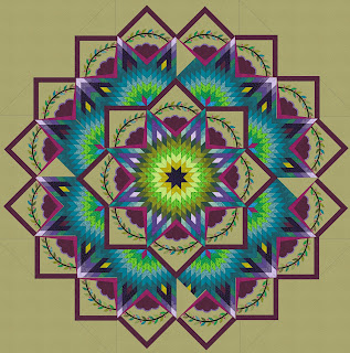
Starting out, my goal was to create pieced diamonds that were in greens and turquoises, and then put applique blocks in a complimentary color like orange. How I got to this design is a bit of a mystery.
Twenty-four appliqued blocks should keep me busy (and probably bored) for ages. What I found fun was to play with the frame and background colors, in search of that perfect combination. Somehow, I always gravitate to the purple.Then I removed the outer frame, thinking this would reduce the size a bit. Did the frame look redundant?... I may also investigate adding more leafy applique in those corners.
The lighter frames brought a different look. I kind of like it.
...or maybe a slightly softer shade...??
Nah, deeper has more power. Now I'm cooking with gas. What you will notice, is that initially I always go to a neutral background color of soft taupe or sage. White and ivory are just too stark and are waiting to be bled on. Soft green usually feels right.
But then I inadvertently changed the background to my nemesis color -- brown. It is no secret, I hate brown. It is only marginally easier to work with than black, and is just well the color of bark. Or dog turds. Bot, wow! I mean WOW! This design just hit me as powerful. I tried hard not to like it, but it may be growing on me because it makes all the quilt's other features pop.
I fiddled with using two shades of brown. This has a lighter outer area. My thought is that this may be easier to see to quilt on.
Then I played with lighter on the blocks and darker in the background. Interesting. These both had frames that were read. I never really thought I loved red and brown together, but maybe I will ponder that a bit.
Maybe I am more of a pink gal...Yes, this I like better than red. It is sassy, and I like it.
This has a little more color.
Two shades of pink?
Pink and orange? It just makes me want to run to my favorite online shop and buy 16 yards of brown fabric. LOL! It is very colorful, in a happy way. I don't have the faintest idea how I'd quilt brown fabric, but I know I'd be adopting a newer more-colorful language doing so.
First I must ponder a couple of client quilts, get my purple applique quilt pushed a little further and then maybe I will pull some fabrics and actually ponder making this magical mandala!


4 comments:
Love your explanations of your color progressions. I like the brown and pink and hope you become inspired to continue with this. Also it's nice to know I'm not the only one who struggles with EQ. I tore my hair out trying to draft a mariners compass, and turning blocks on point. One day I shall master it.
WOW! You're really making me re-think my color combinations, and whatever you settle on, I'm sure it will be fabulous. I do love those browns in there!
Thank you for sharing your process.
Wow! What’s a fascinating post. I have so many questions, but I’ll limit it to two. One, did you have to draw any of the blocks, for example the appliqué sections, or were they in the library? Two, I would you consider teaching an EQ class?
Thank you so much for sharing your design process with us.
Post a Comment